The Vibeary — collection
Design Systems & Foundations
Public design systems are free, battle-tested documentation of decisions you would otherwise make twice. This shelf gathers the open systems worth reading end to end, plus the token infrastructure that keeps them in sync with code, accessibility references, and the writing on craft and principles that explains why the good ones hold up over years.
Inside Design Systems & Foundations
Gems in this collection
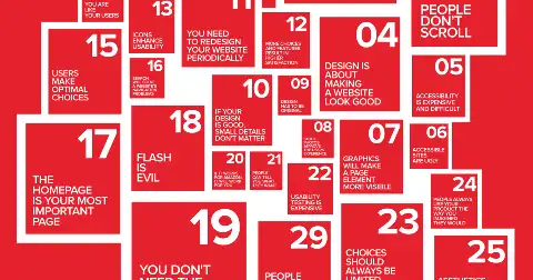
UX Myths
Collection debunking common UX misconceptions, each backed by cited research and expert articles rather than opinion.

Monzo Tone of Voice
Bank's public tone-of-voice guide with concrete before-and-after rewrites for money, error and sensitive-situation messaging.
Stark
Accessibility suite with Figma, Sketch and browser plugins covering contrast, focus order, alt text and vision simulation.
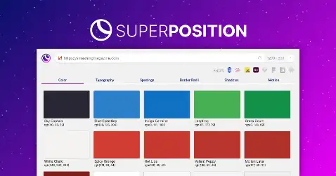
Superposition
Desktop app that extracts colour, type and spacing tokens from any live website and exports to CSS, Figma or XD.

A11Y Project Checklist
Community-maintained WCAG checklist grouped into eighteen practical categories with plain-language, testable success criteria.

Growth.Design Psychology
Catalogue of 106 cognitive biases mapped to the four stages of user decision-making, with product examples and a PDF cheat sheet.
Design Systems Repo
Long-running directory of public design systems, articles and tools, organised by company with external links.

Mailchimp Content Style Guide
Public content style guide covering voice, tone, grammar, accessibility of language and writing for specific interface contexts.
Helios
HashiCorp's design system covering Ember and React components, icon set and developer-tool interface conventions.

Cedar
REI's design system with Vue components, outdoor-brand foundations and a published component lifecycle and deprecation policy.

Cloudflare Style Guide
Cloudflare's public documentation style guide defining component usage, terminology and writing conventions for technical content.
ARIA Authoring Practices Guide
W3C's reference implementations for thirty accessible widget patterns, each with keyboard maps, ARIA semantics and working examples.
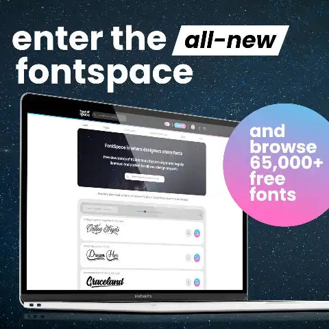
FontSpace
Library of 160,000+ free fonts with 19,000 cleared for commercial use, each licence manually verified before listing.
Tokens Studio
Token management platform with Figma, Penpot, VS Code and GitHub integrations plus theme and mode composition.
ui.jln.dev
Free browser tool generating and browsing hundreds of shadcn/ui theme variable sets with instant copy-paste CSS output.

Siemens iX
Industrial design system for control and automation interfaces, with dark-first theming and dense-data component variants.
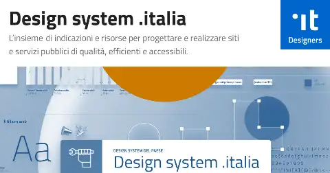
Designers Italia
Italian public-administration design system with components, service-design kits and legally-mandated accessibility requirements.

Radix Colors
Thirty-two twelve-step colour scales where each step has a defined UI role, with automatic dark and alpha variants.
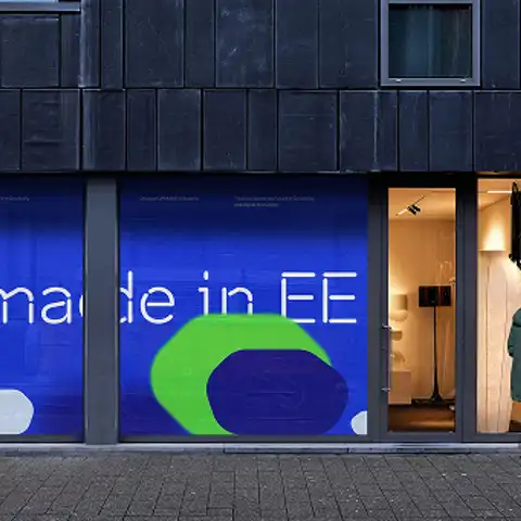
Brand Estonia
National brand system with logo grids, typography, photography direction and downloadable asset kits for a whole country.

PIE
Just Eat Takeaway's design system spanning web, iOS and Android with shared tokens and documented ordering-flow components.

Nachos
Trello's design system documenting board, card and drag-and-drop interaction patterns alongside its visual foundations.
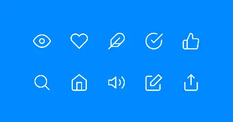
Feather Icons
Open-source icon set drawn on a 24-pixel grid, customisable by size, stroke width and colour, exported as SVG.
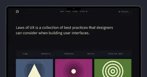
Laws of UX
Collection of over thirty psychological and usability laws, each with a plain explanation, origin and applied design guidance.

Nutilz Color Shades Generator
Single-purpose tool that expands one base colour into a full tint and shade ramp ready for a token file.
Skyline
Benevity's design system for social-impact and giving products, covering components, tokens and inclusive-content guidance.
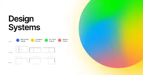
DesignSystems.com
Figma's design systems publication with long-form guides on tokens, iconography, spacing, content strategy and design operations.
Deceptive Design
Taxonomy of eighteen manipulative interface patterns with a 200-example hall of shame and the relevant regulatory enforcement actions.
Terrazzo
CLI that compiles DTCG token JSON into CSS, Sass, TypeScript, Swift and Tailwind outputs, successor to Cobalt UI.

design.systems
Community hub linking design system Slack groups, newsletters, events and a curated resource index maintained by practitioners.
Dembrandt
Node tool that drives a real browser to extract a site's logo, colours, typography, borders and motion into tokens.

Atlantis
Jobber's design system for field-service software, with React and React Native components and scheduling-specific patterns.
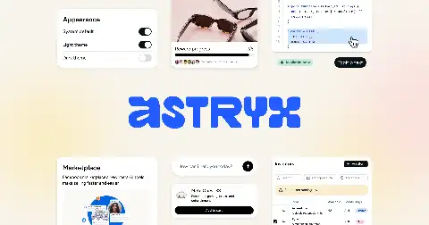
Astryx
Meta's public design system documentation for its component set, foundations and interaction conventions.
Design Tokens (Figma plugin)
Figma plugin exporting styles and variables to Style Dictionary-compatible JSON, with direct push to GitHub or GitLab.
css.gui
Visual, parametric CSS editing environment that treats every CSS property as an editable, themeable design parameter.

Knapsack
Design system platform combining live code components, token management, prototyping and enterprise governance in one workspace.
a11y-contrast
Command-line tool that checks colour contrast across a palette or config file, suitable for CI pipelines.

Guidepup
Automation library that drives real VoiceOver and NVDA screen readers from Playwright or Jest for end-to-end a11y tests.
DTCG Community Group
W3C community group repository holding the design tokens specification, its issue history and the format's ongoing design debates.
shadcn Studio
Theme editor and extended component gallery for shadcn/ui, with visual token editing and exportable theme files.
Modern Font Stacks
Fifteen curated CSS font-family stacks using only system-installed typefaces, with per-stack Unicode coverage tables and live previews.
Virtual Screen Reader
JavaScript screen reader simulator that lets you assert on screen-reader output inside normal unit and integration tests.
asimonim
Language server, CLI and editor extensions giving autocomplete, hover docs and validation for design tokens inside your editor.
Barista
Dynatrace's design system for dense observability UIs: data tables, charts, filters and monitoring-specific layout patterns.
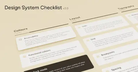
Design System Checklist
Open-source checklist covering planning, foundations, components, documentation and adoption stages of building a design system.

Design Systems Survey
Sparkbox's multi-year survey of design system teams reporting on adoption, staffing, governance and measured outcomes.

Design System Gallery
Curated gallery of design systems with screenshots and filters, surfacing systems from Michelin, Carrefour, LINE and national governments.
storybook-design-token
Storybook addon that parses your stylesheets and icon files to auto-generate a live, always-current token documentation panel.

MagentaA11y
T-Mobile's generator that produces accessibility acceptance criteria per component for web, iOS and Android test plans.
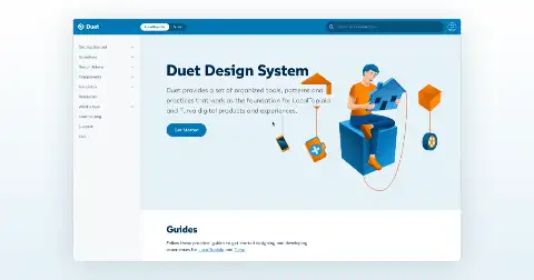
Duet
LocalTapiola's insurance design system with web components, WCAG 2.1 AA conformance evidence and Finnish-language content rules.
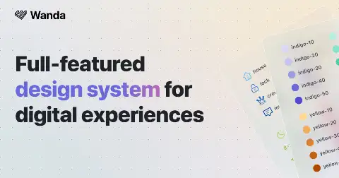
Wanda
Wonderflow's open design system pairing a React component library with an unusually clear written rationale for each foundation decision.

Pharos
JSTOR's design system with web components, editorial typography rules and academic-content layout patterns.
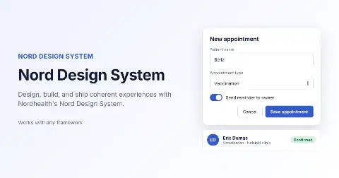
Nord
Nordhealth's healthcare design system built on framework-agnostic web components with strong accessibility and clinical density guidance.
Figmagic
CLI that pulls tokens, graphics and React components out of a Figma file into a versioned codebase automatically.
stylelint-a11y
Stylelint plugin that catches accessibility problems in CSS itself, such as removed outlines and unsafe media-query overrides.
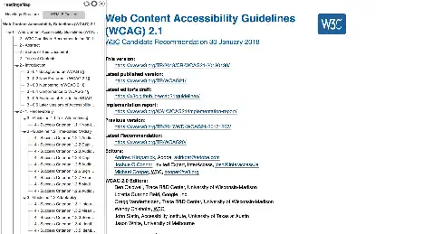
Headings Map
Browser extension that renders a document's heading outline and flags skipped or misordered heading levels instantly.
Branding Style Guides
Searchable archive of thousands of brand manual PDFs, filterable by year, country, industry, language and page count.
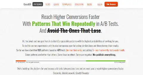
GoodUI
Seventy-five conversion patterns plus a searchable database of real A/B test results from large consumer products.
Style Dictionary
Build system that transforms a single token source into platform-specific outputs for web, iOS, Android and beyond.

UX Patterns for Devs
Ninety-plus UI patterns documented for developers with when-to-use guidance, accessibility rules and comparison pages between similar patterns.
Theo
Salesforce's original token transformer, converting a single source into Sass, Less, JSON and native platform formats.
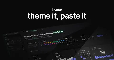
Themux
shadcn/ui theme generator producing OKLCH-based CSS variable sets with live component previews across light and dark modes.

Atomic Design
Brad Frost's book, free in full online, defining the atoms-to-pages hierarchy most design systems still organise around.
Red Hat Design System
Red Hat's system built on framework-agnostic web components with strict token layering and published a11y test results.

Kontur Guides
Russian enterprise-software design guidelines covering forms, tables, errors and dense B2B interaction rules in unusual depth.

Braid
SEEK's design system where components are constrained by design tokens so invalid layouts are literally uncompilable in TypeScript.
UIDX
Local design canvas that stores pages as diffable .uidx JSX files in your repo, with CLI and MCP so agents and humans share one workspace.

Bootstrap Tokens
Bootstrap 6 design system as DTCG tokens with a browser theme builder that exports Sass, CSS, TypeScript, Style Dictionary and Figma.
Default File UI
Open design system with OKLCH scales, copyable React components, CLI registry, and an MCP server for agent installs.
Korean Layout Compositions
277-card atlas of composition principles, with Hangul typesetting and original Korean traditional layouts generated from JSON diagrams.
DesignSystems.one
Gallery of 89 real design systems with tokens and downloadable design.md files, plus an agent-readiness index and free token, contrast and grid tools.
Utopia
Calculators that generate fluid type, space and grid scales interpolating between a small and large viewport, so layouts scale without breakpoints.
weid
CSS-only convention marking which sentences in AI-assisted text are human: three span classes render as solid, dashed and dotted underlines.

Microcopy
Curated set of 500+ real interface copy examples sorted by context: headlines, CTAs, error messages, account flows and slogans.
Super Friendly Design Systems
Dan Mall's collection of design system practice: process essays, pilot-project methodology and adoption tactics for real organisations.
Det Fælles Designsystem
Denmark's shared public-sector design system with web components, tokens and Danish content and accessibility standards.
The Grid System
Reference archive of grid-based design: systems, calculators, templates, tutorials, book recommendations and downloadable layout resources.
Fractal
Node tool for building and documenting component libraries from plain templates, framework-agnostic and driven by a simple config.
Lens
Loom's design system documenting components, motion and the video-capture product surfaces behind the app.
Palette
Artsy's React and React Native design system with an art-world visual language and shared cross-platform primitives.
UAE Design System
United Arab Emirates government design system built RTL-first with bilingual Arabic and English component specifications.
Modulator
Single-page tool for experimenting with spacing scales and base units, showing the resulting rhythm live as you adjust.

Kaizen
Culture Amp's design system with React components, illustration library and explicit inclusive-design and content principles.
Inclusive Components
Heydon Pickering's long-form teardowns of eleven UI patterns, each reasoning from markup semantics to progressive enhancement.
Naming Tokens in Design Systems
Nathan Curtis's taxonomy of token naming across category, property, concept, variant, state, scale, mode, object and namespace.
Checklist Design
Detailed pre-ship checklists for pages, components and flows, covering the small details designers routinely forget.
Codex
Wikimedia's design system in Vue 3, built for extreme internationalisation, RTL support and low-bandwidth contexts.

Fluid Design System
ENGIE's design system with web components, an energy-sector brand layer and documented eco-design and sustainability guidance.
Système de design de l'État
French government design system with a strict, mandatory brand and component set enforced across all state websites.
Louder Than Ten Manual
Open manual on digital project practice covering scoping, estimation, communication and the operational side of design work.

Luna
Sainsbury's design system covering grocery e-commerce components, accessibility standards and retail content guidelines.
Orbit
Kiwi.com's travel-oriented design system with React components, Figma libraries and documented booking-flow patterns rarely found in generic systems.
Streamline
Icon platform indexing roughly 450,000 icons across proprietary families and mirrored open sets like Material, Tabler and Remix.

Westpac GEL
Australian bank's design system with React components, extensive form patterns and documented financial-services accessibility requirements.
.pulse
Heartbeat Agency's open design system aimed at agency teams, with components, tokens and a lightweight governance model.
Project Wallace Design Tokens
Statically analyses any CSS file or live URL and extracts the implicit design tokens already hiding in it.
IBM Design Language
IBM's foundational design language covering colour, type, motion, grid, iconography and its underlying design philosophy.
The List of Public Design Systems
Continuously updated index of sixty-plus public design systems with direct links to their live documentation sites.

KRDS
Korean government design system covering components, typography and Hangul-specific typographic and spacing rules.
Backpack
Skyscanner's design system with React, iOS and Android implementations plus documented motion and RTL specifications.
Auro
Alaska Airlines' design system built entirely on Lit web components with published accessibility conformance reports.
Geist
Vercel's design system: colour and typography foundations, Geist Sans and Mono typefaces, icon set and React components.

Liquid
Merck/EMD's design system built on web components with a distinctive brand-expressive theming layer over neutral primitives.
Marcel
Carrefour's design system spanning retail web and app, with commerce components and a documented token architecture.

Motion
Michelin's design system covering web components, brand foundations and industrial B2B interface patterns.
Odyssey
Okta's design system focused on identity, auth and security flows with React components and Figma kits.
Origami
Financial Times' component system built as versioned, independently-releasable modules rather than one monolithic package.
Saga
Grafana's design system covering dashboard components, chart theming and the tokens behind its light and dark modes.

TokensBrücke
Figma plugin that exports Figma variables and styles to W3C DTCG-format token JSON with configurable naming.

Dispersa
DTCG-native token build system supporting resolver documents, sets and modifiers, exporting CSS, Tailwind v4, Swift and Compose.
Engramma
Browser-based design token editor and converter that previews colour, type and spacing while exporting standard token formats.

Mística
Telefónica's multi-brand design system where one component library serves Movistar, O2, Vivo and Tu through swappable skins.

Tanaguru Contrast Finder
Tool that suggests the nearest passing colour alternatives when a pair fails contrast, instead of just reporting failure.
Asphalt
GO-JEK's design system covering mobile-first components, illustration language and Indonesian-market localisation guidance.

Calcite
Esri's design system for mapping applications: web components, map-specific controls and a large geospatial icon set.

Instructure UI
Education-platform design system with React components, strict accessibility gates and a documented deprecation and codemod process.
Porsche Design System
Automotive design system delivered as framework-agnostic web components with strict brand-compliance validation baked into the tooling.

Pattern Lab
Atomic-design pattern engine that composes components from atoms upward and generates a browsable pattern library.
Clever Components
Clever Cloud's open library of framework-agnostic web components for cloud-console interfaces, with per-component docs and demos.
Design System Cookbooks
Directory of over a hundred open-source design systems, filterable by framework, license and organisation type.
Circuit UI
SumUp's React design system for payments and point-of-sale interfaces, with documented money-input and currency patterns.

Intergalactic
Semrush's design system with React components, a charting layer and documented rules for data-heavy SaaS interfaces.

Vitamin
Decathlon's design system spanning web, Flutter and native, with sport-retail components and a shared token source.

Design Token Validator
Web tool that checks a token JSON file against the DTCG specification and reports structural and type errors.
Leonardo
Adobe's contrast-first colour tool: define target contrast ratios and it generates the colours, plus adaptive theme output.