The Vibeary — tag
react
288 resources in The Vibeary tagged "react" — tools, libraries and references pulled from across the library's shelves, each one checked by hand before it was added.
Gems in this collection
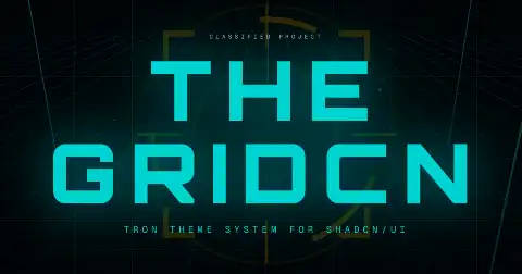
The Gridcn
Tron-inspired shadcn/ui theme shipping 55+ restyled components with glow, grid and neon treatments.
Devouring Details
Paid interactive reference manual on interaction detail — motion choreography, inferring intent, simulating physics — with downloadable React prototypes.
Motion
Hybrid engine combining the Web Animations API with a JS spring runtime, shipping React, Vue and vanilla bindings.

Turbopills UI
React component set purpose-built for telehealth products — intake, scheduling and clinical display patterns.

Novu Inbox
Open-source notification infrastructure whose drop-in React Inbox component renders a themable in-app notification centre with preferences and digests.
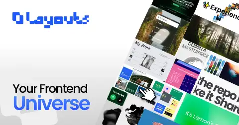
UI Layouts
Toolkit of animated React components, scroll effects and full page layouts built on Tailwind and Motion.
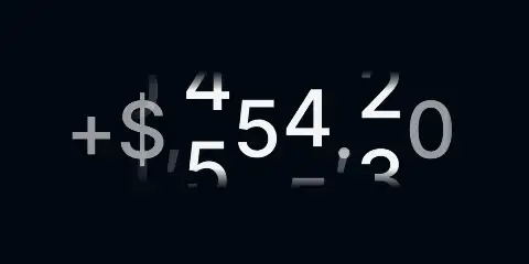
NumberFlow
Animated number component that transitions digits, separators and signs correctly across locales, for React, Vue, Svelte and vanilla.
Shadix UI
Small registry of production-ready animated shadcn/ui components built with React, Tailwind and Framer Motion.
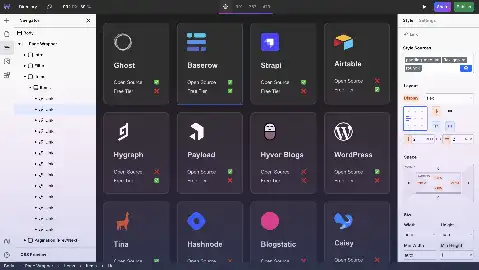
Webstudio
Visual website builder producing real code, positioned as an open alternative to Webflow with a component-based canvas.
React Bits
Large open-source collection of animated, interactive React components with copy-paste and CLI installation.
ShaderGradient
Animated 3D gradient meshes exportable as React components, Figma fills or Framer layers with camera and colour controls.

MVPBlocks
Copy-paste responsive block library aimed at shipping an MVP landing page and dashboard quickly.
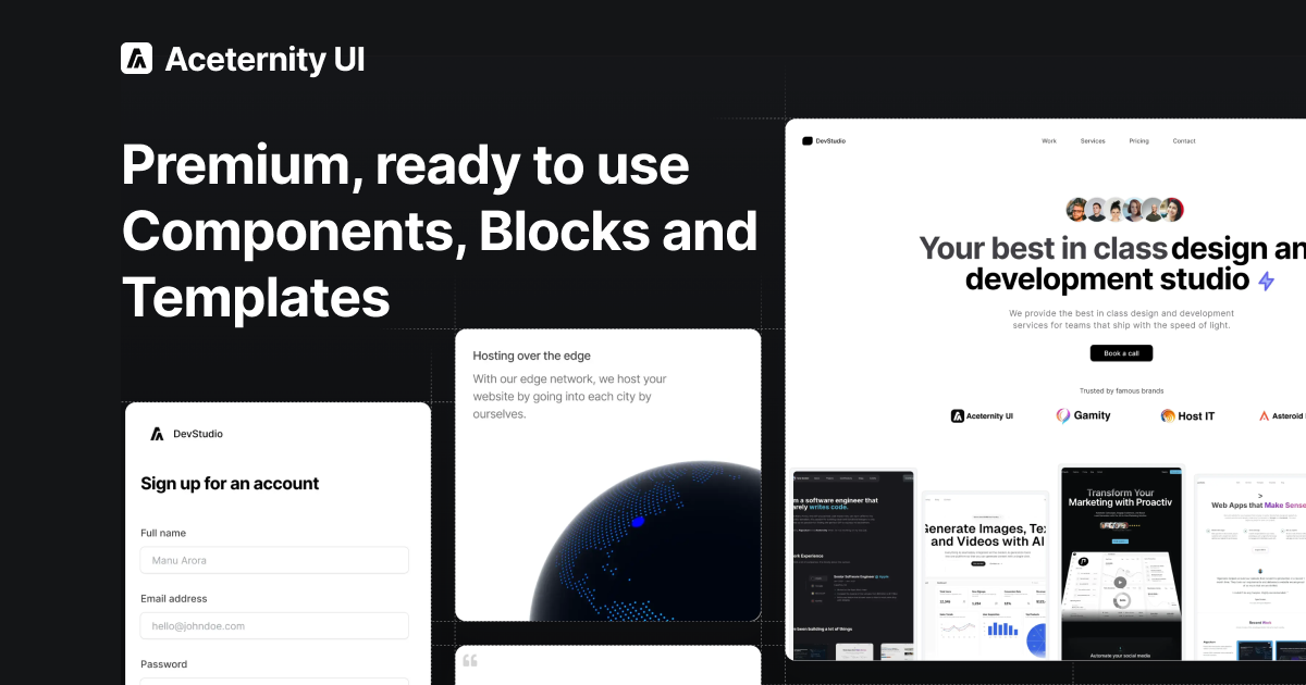
Aceternity UI
200+ copy-paste React components, blocks and landing templates built on Tailwind and Motion, heavy on 3D, background and text effects.
crd-ui
Credit and debit card React component with automatic brand detection and a 3D flip interaction.
usva
React design language shipped in three themes (atmospheric, dense, light) generated from one shared token vocabulary.
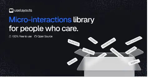
useLayouts
Premium layout components and micro-interactions focused on page structure rather than individual widgets.

Boring Avatars
Generates deterministic SVG avatars from a name string in several geometric styles, as a React component or API.
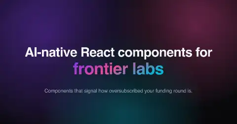
Performative-UI
Joke React component library of startup design tropes, packaging the visual language of oversubscribed funding rounds as installable components.
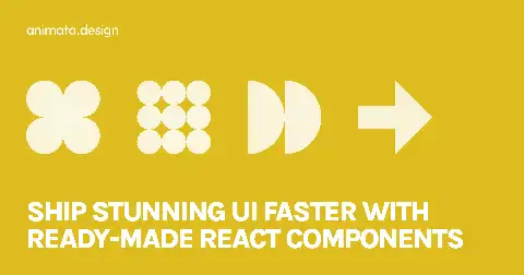
Animata
Hand-crafted interaction and micro-animation snippets for React and Tailwind, browsable by effect.
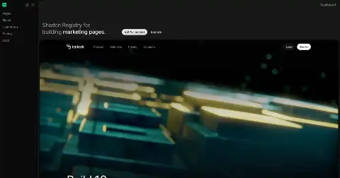
Tailark
Pre-built marketing-website UI blocks based on shadcn/ui: heroes, pricing, feature grids and footers.
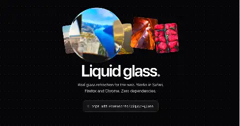
liquid-glass
Headless React lens component that actually refracts the live page underneath it rather than faking blur.
glitchcn-ui
Cyberpunk terminal-themed React component library with glitch effects, scanlines, neon accents and monospace-first layout.
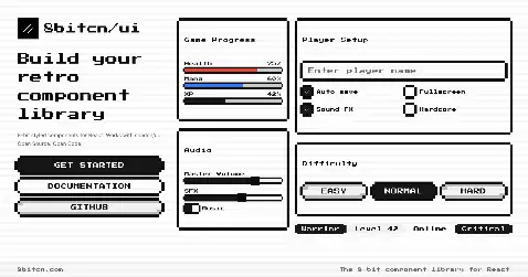
8bitcn UI
shadcn/ui components restyled as pixel-art 8-bit widgets with accessible behaviour preserved underneath.

REACT-VFX
React component wrapper for VFX-JS applying WebGL shader effects to img, video and text elements through props.

RetroUI
React component library applying a neo-brutalist retro design system across buttons, cards, dialogs and form controls.
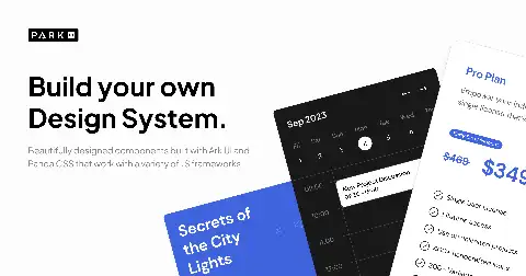
Park UI
Component library built on Ark UI and Panda CSS that ships the same API to React, Solid and Vue.
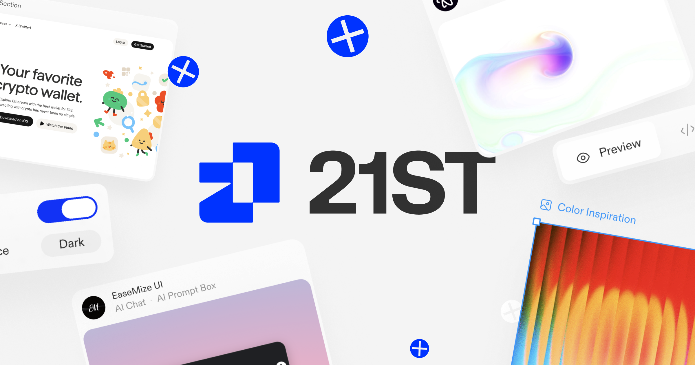
21st.dev
Community registry of 12,000+ React and Tailwind components, templates and shadcn themes published by 700+ design engineers, with AI-ready copy prompts.

Kibo UI
Composable shadcn-style registry adding AI chat, kanban, gantt, dropzone, code block and other blocks the core library omits.

Float UI
Free Tailwind components and full page templates published simultaneously for React, Vue, Svelte and plain HTML.
SmoothUI
Animated React components and UI blocks built with Motion, distributed as copy-paste source.

Paper Shaders
Zero-dependency animated canvas shaders including mesh gradients, grain, dithering and warps, shipped as React components and vanilla JS.
Morphicons
SVG icon library that morphs one glyph into another using closed-form optimal rotation and spring physics, across six frameworks.
React Email
React component primitives and 24 prebuilt template categories that render to email-client-safe HTML, plus a local preview server.
Fancy Multi Select
Multi-select combobox pattern with chips and keyboard editing, published as a documented craft post with source.
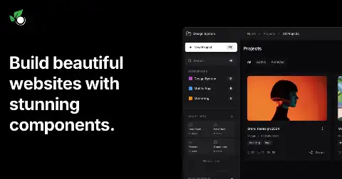
Kokonut UI
Free Next.js and Tailwind component collection focused on cards, AI chat surfaces and dashboard widgets.
Reaflow
Modular React diagram engine using ELK.js for automatic layout, with node nesting, drag-drop and undo/redo.
Reagraph
WebGL graph visualisation for React with 2D and 3D layouts, clustering, path finding and lasso selection built in.
AI Canvas
Animated React and Tailwind components, blocks and design systems distributed through the shadcn CLI.
tablecn
Data table and data grid built on shadcn/ui and TanStack Table with sorting, filtering, faceting and URL state.
pqoqubbw/icons
Open-source set of smoothly animated Lucide-style icons as React components with motion on interaction.

Open SaaS
Full SaaS template on the Wasp framework with auth, Stripe or Lemon Squeezy billing, admin dashboard and Astro blog.
magic-mcp
MCP server from 21st.dev that generates production-ready React UI components from natural language descriptions.
use-gesture
Hook and vanilla library normalizing drag, pinch, wheel, scroll and hover into velocity- and offset-aware gesture state.
Onlook
Open-source visual editor that lets you style and edit a running React app directly and writes the code changes back.
Plate
Rich-text editor framework for React built on Slate, with plugin packages and a shadcn component registry.
Extro
Browser extension starter kit with React, Tailwind, typed messaging, i18n, billing and cross-browser build tooling.
glasscn-ui
Glassmorphism variant layer over shadcn/ui components with blur, translucency and layered depth tokens.
xyflow (React Flow / Svelte Flow)
Node-based UI libraries for React and Svelte with minimap, controls, custom nodes, edge routing and viewport helpers.

Atlantis
Jobber's design system for field-service software, with React and React Native components and scheduling-specific patterns.
shadcn-image-cropper
Image cropping component for React combining react-image-crop with a shadcn dialog and controls.
vaso
React component wrapping the liquid glass effect with props for blur radius, refraction strength and edge highlight.

shadcn-phone-input
Phone number input with country selector and validation powered by libphonenumber-js, styled for shadcn.
react-spring-bottom-sheet
Accessible spring-physics bottom sheet for React web with focus trapping and snap points.
react-multi-email
Input that tokenises multiple email addresses as the user types, validating and chipping each one.
basement scrollytelling
React and GSAP library for declarative scroll-driven animation timelines with waypoints and parallel tweens.
Liveline
Real-time animated line chart component for React designed for streaming data at high frequency.
Semiotic
React dataviz framework built around annotation, network and ordinal frames rather than chart-type presets.
io-808
Fully recreated web-based Roland TR-808 drum machine with working sequencer, built in React and Web Audio.
LyteNyte Grid
Zero-dependency React data grid offering headless or pre-styled modes with pivoting, grouping and server-side data.
Windrift
JavaScript framework for mutable stories where prose rewrites itself as the reader makes choices.
UIAble
Open shadcn-based UI system with 700+ items aimed at production apps, maintained by the CodedThemes team.
a11y-starter-kit
WCAG 2.1 AA starter kit with accessible component implementations and the audit patterns to keep them compliant.
Ark UI
Headless component library built on Zag.js state machines, with identical APIs across React, Vue, Solid and Svelte.
chart-parts
Grammar of graphics for React from Microsoft Research, a React-native reimplementation of Vega's compositional model.
kbar
Portable, extensible cmd+K interface for React with nested actions, fuzzy search and keyboard-first navigation.
Minimal Tiptap
Compact WYSIWYG editor component styled with shadcn/ui, wrapping Tiptap with a toolbar and bubble menu.

flightcn
shadcn-compatible component set for flight and route visualisation: airport pickers, route maps and itineraries.
react-bottom-fixed
React component keeping bottom-fixed elements visible and correctly positioned on iOS Safari.
React95
React component library reproducing the Windows 95 interface, including window chrome, tree views, dropdowns and system icons.
big-calendar
Feature-rich React calendar with month, week, day and agenda views, styled with shadcn/ui.
react-easy-crop
Component for cropping, rotating and zooming images and video with pinch and drag interactions.
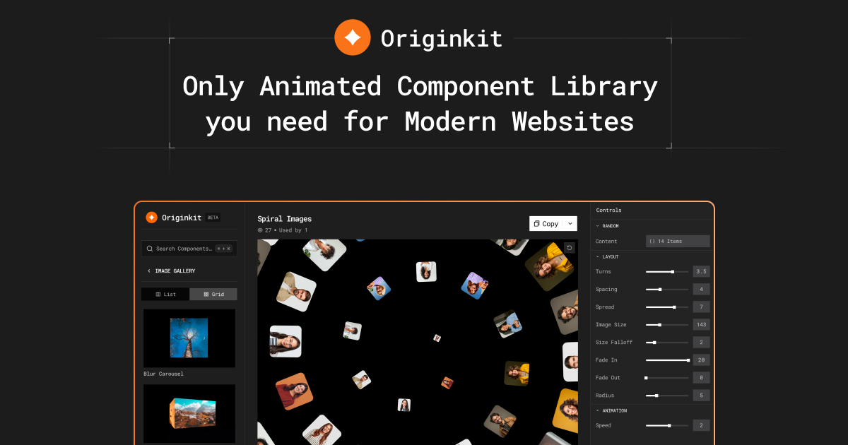
OriginKit
Free library of animated React components consumable three ways: copy-paste code, a Framer integration, or an MCP connection for coding agents.
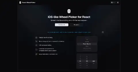
React Wheel Picker
iOS-style scrolling wheel picker for React with momentum, snapping and touch handling.
stackzero-labs/ui
Open component registry for e-commerce storefronts: product cards, variant pickers, carts and reviews.
blocks.so
Clean, minimal building blocks for dashboards and app shells designed to be copied straight into React projects.
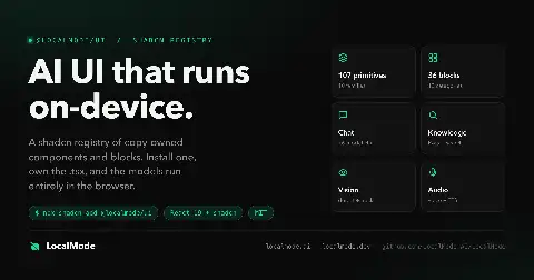
LocalMode
Registry of browser-only AI blocks — chat, RAG, transcription and CLIP image search — that run entirely client-side with no API keys.

PaceUI
UI blocks aimed at real apps and dashboards rather than marketing pages, designed to survive from prototype to production.
Maily.to
Notion-like editor purpose-built for composing responsive HTML emails, with blocks and variable support.
react-modal-sheet
Flexible iOS-style bottom sheet for React on the web, built with Motion and accessibility handling.
Legend-State
Fine-grained reactive state library with automatic persistence and sync plugins, designed to re-render only the components that changed.
Fancy Components
Free open-source collection of unusually expressive React components: physics text, distortion, cursor effects.
Downshift
Primitives and hooks for building WAI-ARIA compliant autocomplete, combobox, select and tag-group components in React or Preact.

Origin UI
Large open collection of Tailwind and shadcn component variations covering inputs, selects, dialogs, navigation and notification patterns.
react-select-search
Lightweight searchable select for React with fuzzy matching, option grouping, multiple selection and no imposed styling opinions.

Coss UI
Component library built on top of Base UI primitives, distributed as shadcn-format source and documented for AI-assisted codegen.
use-scramble
React hook producing randomised scramble and decrypt text transitions with tick rate, speed and character-set controls.
react-rnd
React component that makes any element both draggable and resizable, with grids, bounds, aspect-ratio locking and controlled state.

Indie UI
shadcn-style component set organised around variants, focused on landing pages, forms and interactive controls.
Front-End Resources
Community-maintained documentation site indexing front-end and design resources by topic: CSS, HTML, JavaScript, React, TypeScript, design.
react-scroll-parallax
React hooks and components for scroll-linked parallax on elements, banners and backgrounds with easing and rotation.
shadcn-tree-view
Hierarchical tree view component for React with expand, select and icon support in shadcn styling.
@smastrom/react-rating
Zero-dependency, fully accessible star and custom-shape rating input with keyboard and RTL support.
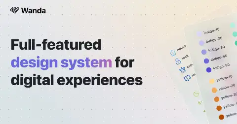
Wanda
Wonderflow's open design system pairing a React component library with an unusually clear written rationale for each foundation decision.

beUI
106 animated React components and blocks — docks, bloom menus, OTP inputs, number tickers — installable through the shadcn CLI.
react-flip-toolkit
Configurable FLIP animation library for React with spring physics, nested and staggered transitions, and scale-corrected children.
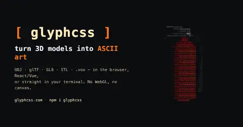
glyphcss
Converts OBJ, glTF, GLB, STL and VOX models into ASCII art rendered as text inside one pre element, with React and Vue wrappers.
awesome-shadcn-ui
Curated GitHub list of shadcn/ui extensions, blocks, templates, registries and tooling built by the community.
react-particle-effect-button
React button that bursts into particles on click, with configurable shapes, direction and easing for the disintegration.

Calligraph
Fluid text transition component powered by Motion, animating between arbitrary strings with per-character flow.

tldraw SDK
React infinite-canvas SDK with multiplayer sync, custom shapes, persistence and full programmatic control over canvas contents.

Manifest UI
Component library specifically for building ChatGPT Apps, shipped from the Manifest backend project.
react-kino
Scroll-driven cinematic storytelling primitives for React under one kilobyte gzipped, built on native scroll timelines.
mantine-border-animate
Mantine component providing beam, glow, gradient and pulse animated borders with full colour and timing control.
21st.dev Agent Elements
Open registry of agent UI primitives: chat shell, tool-call cards for bash/edit/search/todo, clarifying questions and streaming markdown.
devl.dev
Registry of 159+ components built on coss-ui and installable through the shadcn registry CLI.
react-force-graph
React bindings for 2D, 3D, VR and AR force-directed graphs sharing one declarative prop API.
GreatFrontEnd
Front-end interview platform with 3,000+ questions across JavaScript, React, UI coding and system design, plus in-browser testing.
Better Upload
React file upload library that posts directly to any S3-compatible bucket, shipping prebuilt shadcn dropzone and progress components.
Matinee
Programmable ghost cursor for React that moves, clicks, types and scrolls against your live app, then exports itself as an animated SVG.

ReUI
Open registry of React, Next.js and Tailwind components plus functional app examples and animated effects.
fluidkit
React library for liquid glass and metaball UI animations, including morphing nav indicators and blob transitions.
Animate UI
Distribution of fully animated React components built on Motion, shipped as copy-paste source through the shadcn CLI.
Zyeon UI
353 React and Tailwind components where each one ships its live preview, full source, the prompt that generated it, and a concept map.
shadcn-play
Browser playground for shadcn/ui components with a live editor for previewing and tweaking variants.
meshgrad
Generates CSS mesh gradients as layered radial-gradient stacks, with a React helper for randomised output.
Tania Rascia
Personal engineering blog with 177 posts on JavaScript, React, the DOM and web fundamentals, written as complete tutorials.
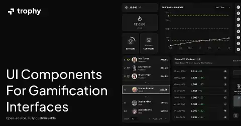
Trophy UI
Gamification components for React covering streaks, achievement badges, XP bars and leaderboards.
figma-plugin-react-vite
Vite-based Figma plugin starter with React, hot reload for the UI iframe and typed plugin/UI messaging.
Stepperize
Headless stepper library for React with typed steps, plus a shadcn-styled component layer.
Payload Components
MIT registry of typed Payload CMS blocks and React components for Payload v3 with Next.js.
Skiper UI
Component library of stacked cards, carousels and scroll-driven interactions distributed through the shadcn CLI.
ReverseUI
Collection of animated React UI components reverse-engineered from the interactions on well-known marketing and product sites.
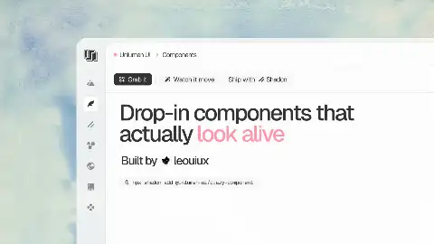
Unlumen UI
Open-source React and shadcn primitives with deliberate motion defaults, published as a small curated set rather than a mega-library.
React Scan
Overlay that highlights which React components re-render and how expensive each render is, with no code changes or babel plugin.

SlidyTabs
Small library adding a sliding indicator animation to tab components with automatic measurement.
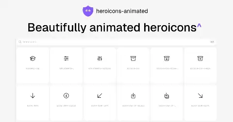
heroicons-animated
316 Heroicons rebuilt as animated React components with hover and state transitions.
gooey-react
Half-kilobyte React component applying the SVG gooey filter so overlapping shapes blob together like liquid metal.
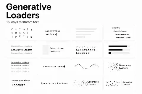
Generative Loaders
Accessible React loading components purpose-built for generative interfaces: streamed text, inline activity and image generation.
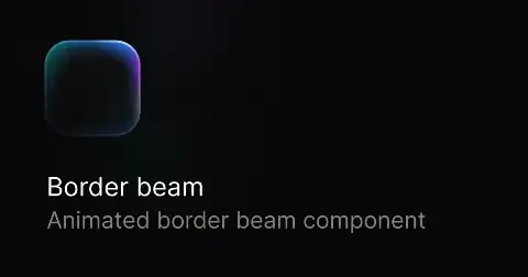
Border Beam
Configurable React component that animates a light beam travelling around an element's border, with live controls and copyable code.
react-simple-maps
React SVG mapping components built on d3-geo, aimed at static thematic maps rather than slippy tile maps.
termcn
Terminal-styled React components rendering panels, prompts and TUI-like widgets in the browser.
smooth-cursor
Physics-based smooth cursor component for React with spring stiffness, damping and rotation-on-velocity options.
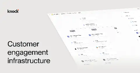
Knock in-app components
Customer messaging infrastructure shipping React feed, toast and inline in-app message components driven by backend workflows.
AutoAnimate
Drop-in utility that watches a parent element and automatically animates children being added, removed or reordered.
dotmatrix
Open collection of 55+ loaders and spinners built with CSS and React, free to copy.
griffo
Kerning-aware text splitting for React that preserves letter-spacing when splitting into characters for staggered animation.
react-fast-marquee
React marquee component using pure CSS animation with pause-on-hover, gradient edges, direction and speed props.

WDS Shadcn Registry
Ten accessible components designed to slot alongside shadcn, published by the Web Dev Simplified channel.

Mailing
Compose transactional emails as React components with a dev preview UI and send from any Node backend.
agentcn
Registry of reusable AI agent recipes and UI scaffolding built on the Eve and Flue runtimes, installable as owned source.
Eldora UI
Registry of animated React and Tailwind components, blocks and page templates installable with the shadcn CLI.
useAnimations
Library of small animated icons — play/pause, menu/close, loading, heart — delivered as Lottie-backed React and vanilla components.
framecn
React component registry for building video interfaces — players, timelines, scrubbers and frame-accurate controls — installed via shadcn CLI.
smart-ticker
Diff-aware animated number and text ticker for React, Vue and Svelte that only animates changed characters.
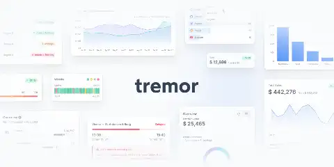
Tremor
Thirty-five open-source React dashboard components — charts, KPI cards, filters, pickers — built on Recharts, Radix and Tailwind.
Animations on the Web
Course on web animation theory and implementation covering easing choice, duration, orchestration and performance, taught through interactive lessons.
Transitions.dev
Copy-paste collection of essential web app transitions: card resizes, modals, icon swaps and particle effects, with a refine tool.
cmdk
Unstyled, composable command menu primitive for React that other command palettes are built on.
interior.dev
React micro-interaction primitives focused specifically on the half-second of feedback right after a user click.
Liquid Gooey
React component and playground producing SVG filter-based gooey blob merging effects for menus, toggles and loaders.
Vaul
Unstyled drawer component for React with native-feeling drag, snap points and nested drawers.
Beste UI
Large registry of production-oriented UI blocks for landing pages, dashboards and web apps — nearly 2,000 catalogued items.

Twenty
Modern CRM with a Notion-like record layout, custom objects, kanban pipelines and a well-designed component system.
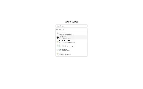
Async Select
Async combobox for React with debounced remote search, loading states and shadcn styling.

Sonner
Opinionated React toast component with stacked, swipeable notifications and carefully tuned motion.
HextaUI
Extended shadcn components and blocks for Next.js covering dashboards, marketing sections and interactive widgets.
Verdant
IndexedDB-backed local-first framework with schema migrations, typed queries, undo history and a self-hostable sync server.
shadcn/ui skills
Official shadcn skills giving agents accurate component context and enforcing shadcn conventions during generation.

@web-kits/audio
Declarative audio synthesis library for the web, letting you compose UI sound from primitives in JSX-like syntax.

Braid
SEEK's design system where components are constrained by design tokens so invalid layouts are literally uncompilable in TypeScript.
Showrunner
Streaming-app style portfolio template with a cold-open intro, Who's watching profile picker that reorders the page for recruiters or clients, seasons, episodes and a printable résumé.
Esvigy
Open-source UI illustration set for empty states and error screens, shipped as tree-shakable React and Vue components with two-tone colour props and CSS-only animations.
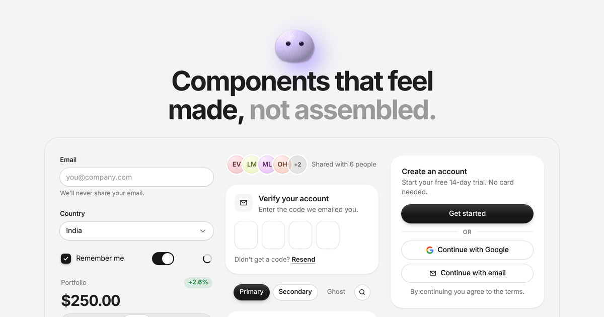
Puffy UI
125 free React parts you copy and own, retinted live by a colour, shape and theme picker, including tactile knobs, dials, glance widgets and AI chat pieces.
UploadCN
Open-source file upload kit for shadcn: 90 upload blocks plus an engine with queues, retries, resumable multipart transfers and adapters for S3, R2, Cloudinary and more.
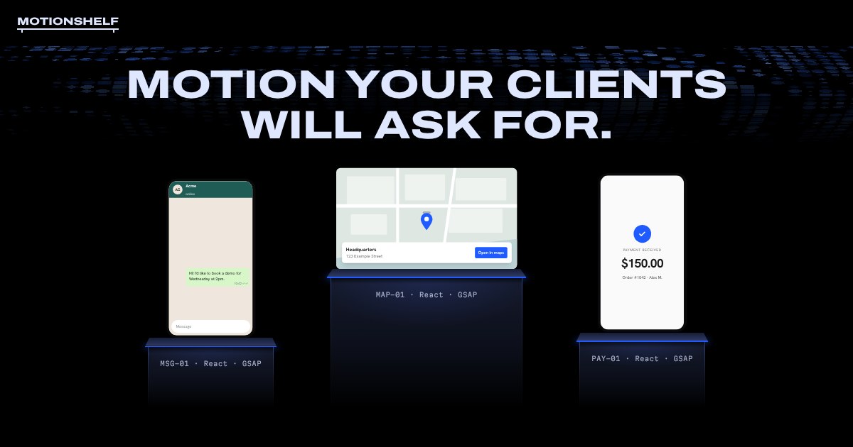
Motionshelf
GSAP-animated React components for sales sites, like order trackers, payment notifications and a sales-funnel sieve, each with a prompt to rebuild it via your agent.
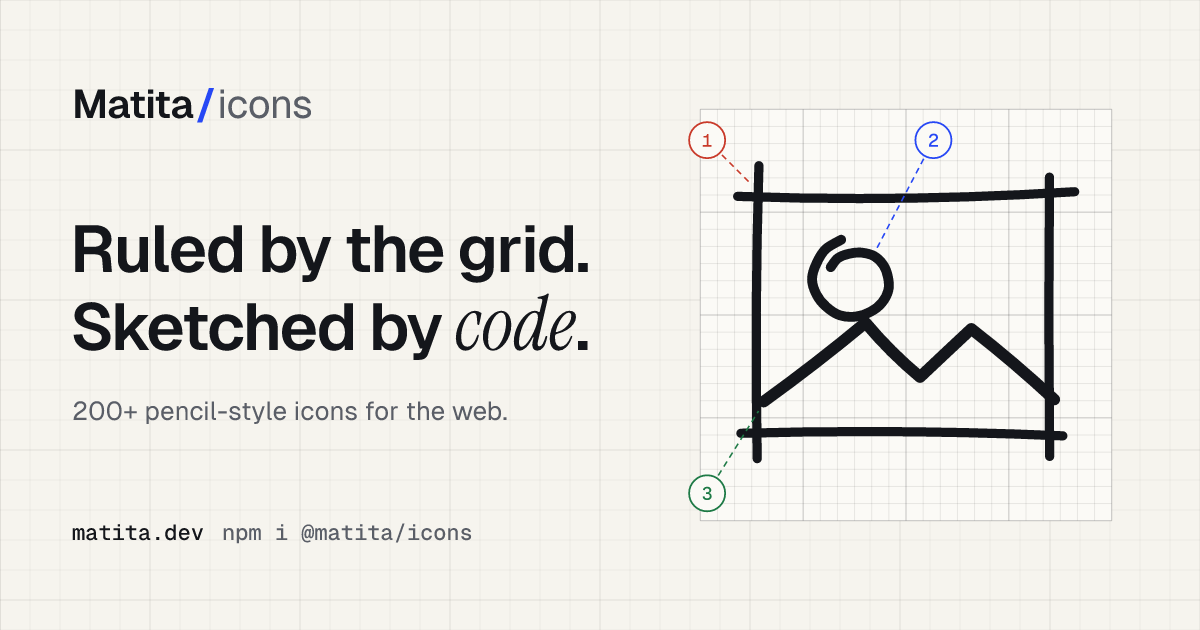
Matita
200 freehand pencil-style icons as SVG and React components, drawn by code so strokes overshoot, corners cross and circles overlap like real pencil.
ecomcn
Open-source shadcn/ui registry of e-commerce blocks: buy boxes, faceted filters, cart sheets and order summaries, installed like any other component.
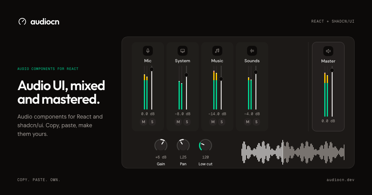
audiocn
Copy-and-paste audio components for React and shadcn/ui: mixers, players, level meters, knobs and waveforms with accessible markup you own.

shadcnmaps
170+ interactive SVG map components for countries, continents and US states with tooltips, selection, markers, zoom and keyboard navigation, installed via shadcn CLI.
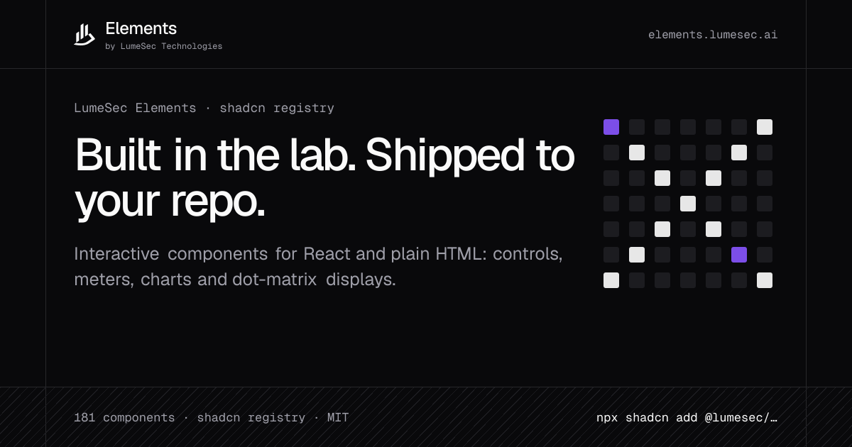
LumeSec Elements
Interactive React components and typed custom elements for shadcn: controls, meters, charts, maps and dot-matrix displays, installed as source with the shadcn CLI.
Colorshot
Open-source color and gradient picker for React and Vue supporting linear, radial and conic gradients plus swatch groups, compatible with shadcn/ui.
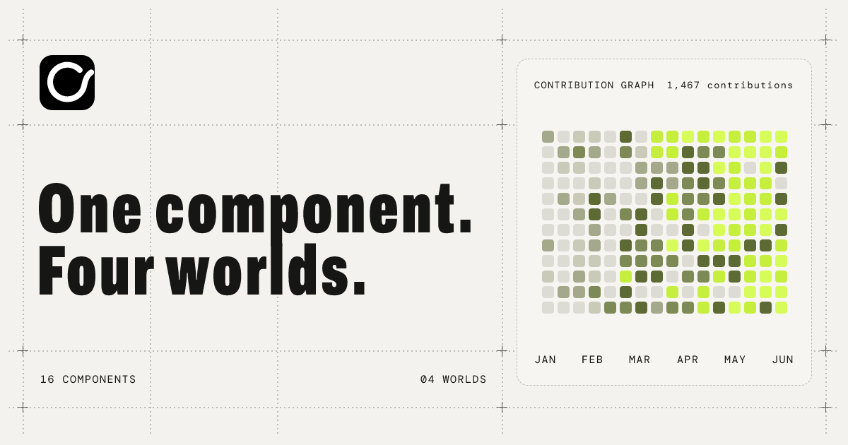
Ovio
16 motion components for developer sites, like contribution graphs, repo cards, star history and physical knobs, each switchable across Minimal, Craft, Retro and Toy worlds.
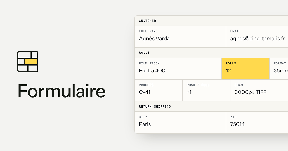
Formulaire
Dense, paper-style grid forms as one stylesheet for plain HTML or as React components on Base UI, modernizing FormKeep's Gridforms.
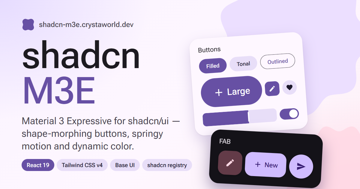
shadcn M3E
79 shadcn/ui components rebuilt in Material 3 Expressive style, with shape-morphing buttons, spring motion and dynamic color from any seed or image.
MUIcn
Free shadcn-compatible MUI and Tailwind components and blocks for React, with TypeScript, react-hook-form, and free alternatives to MUI X-style components.
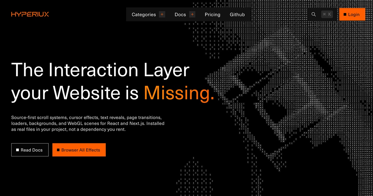
Hyperiux Vault
Source-first interaction effects for React and Next.js. 50+ free effects, more in Pro.
robot-heads
Animated 3D TV-headed robot heads for React whose LED faces change expression to show what your AI agent is doing right now.
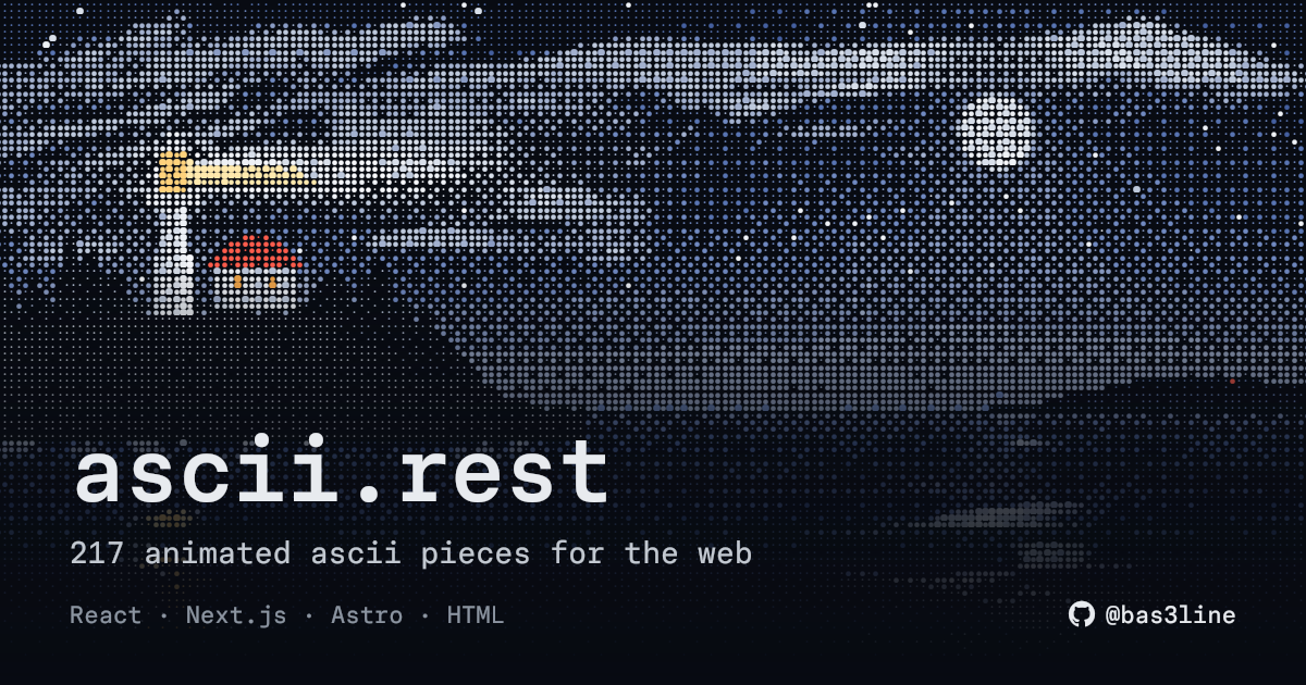
ascii.rest
Library of 217 animated ASCII art pieces for web pages, written in dependency-free TypeScript and usable from React, Next.js, Astro or a single HTML tag.
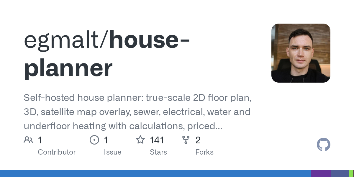
House Planner
Self-hosted house planner with true-scale 2D floor plans, 3D preview, satellite overlay, plumbing and electrical networks, and a priced bill of materials.
iPhone Wedding Invitation
Wedding invitation site disguised as an iPhone: guests unlock it, RSVP in Safari, see the date in Calendar, venue in Maps, album in Photos.
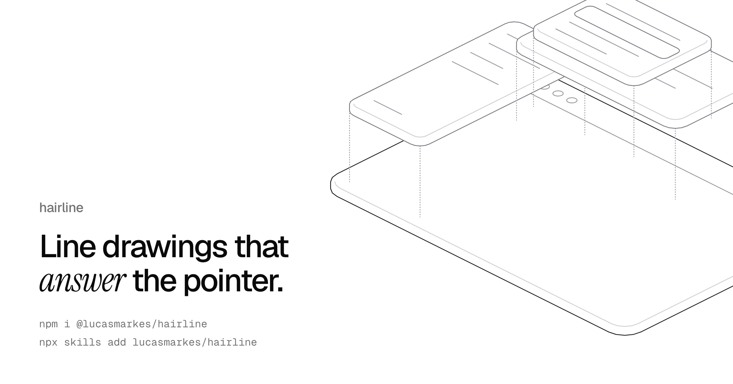
hairline
Set of isometric line-art SVG figures that react to the pointer, dependency-free, with React components and plain DOM usage.
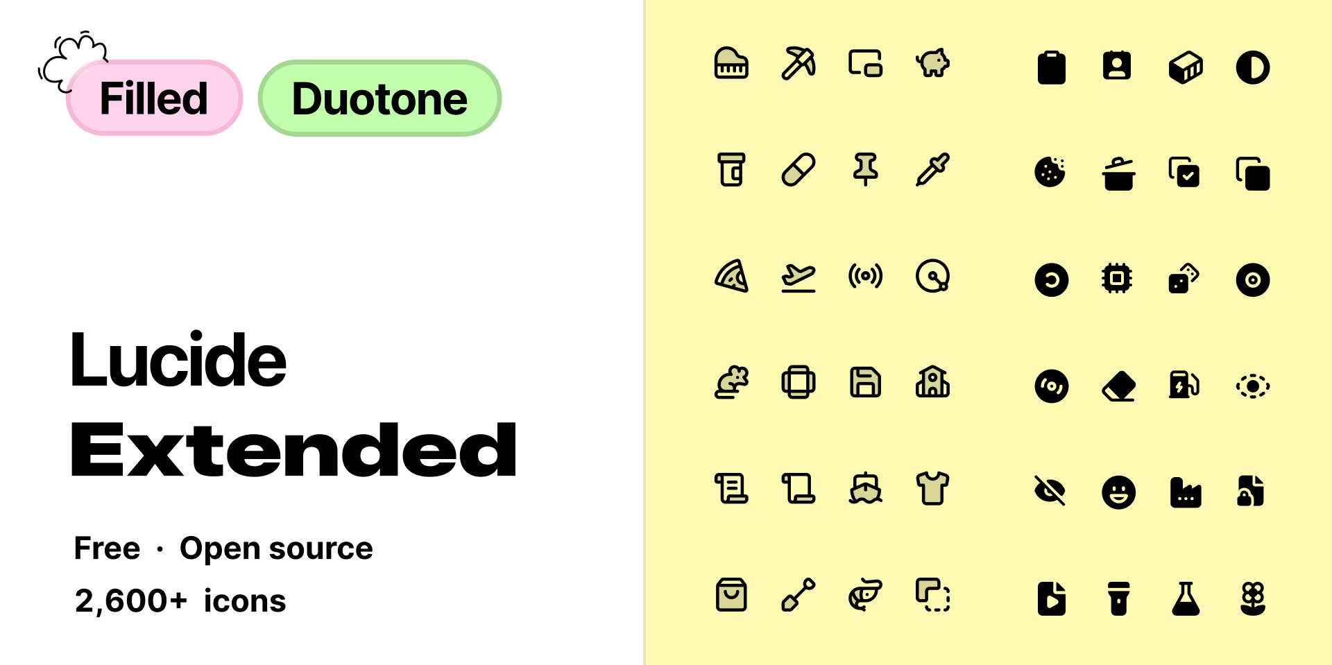
Lucide Extended
Filled and duotone versions of Lucide icons with identical shapes and names, searchable across 2,600+ icons and copyable as SVG or React.
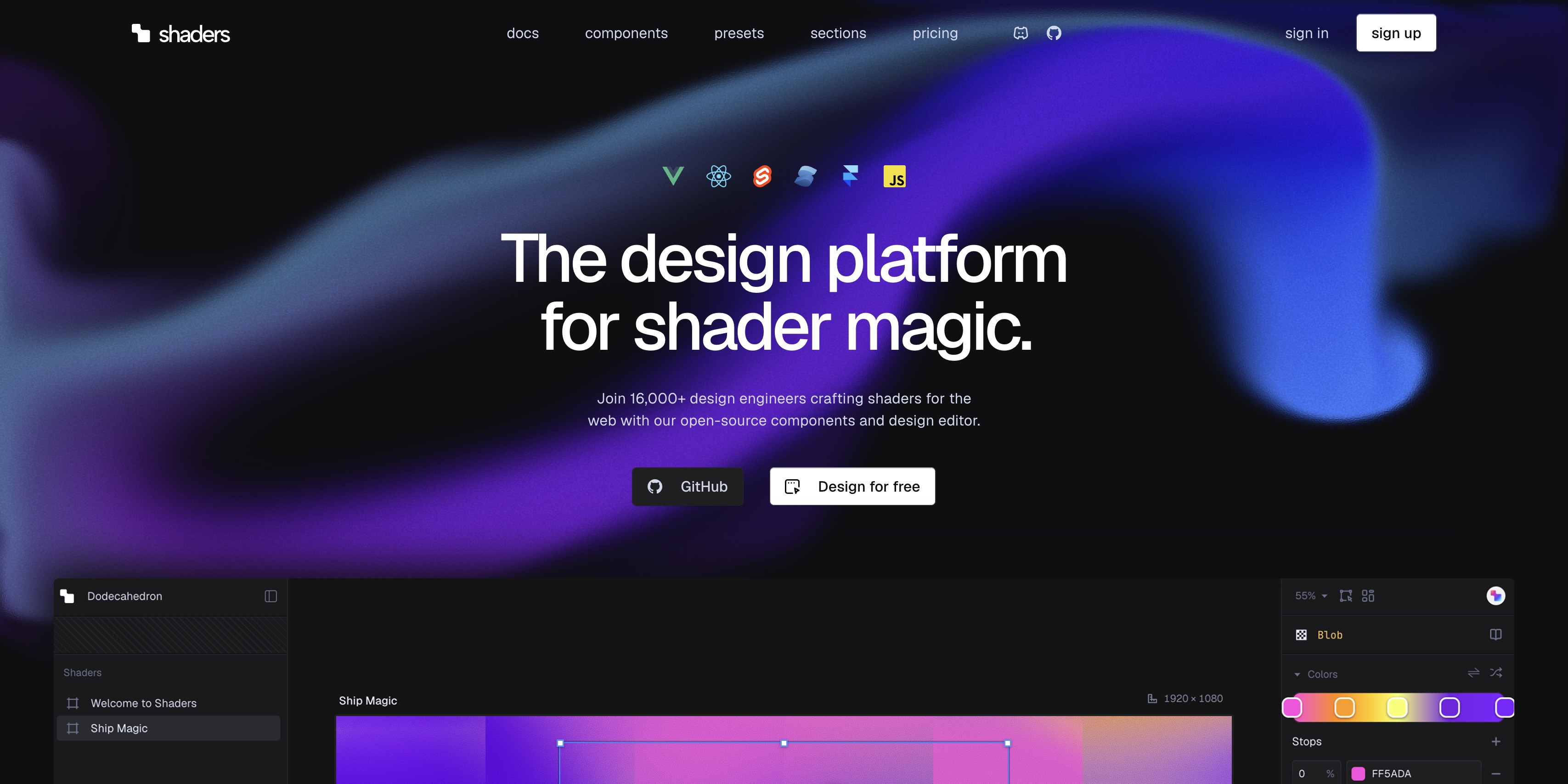
Shaders
Newly open-sourced WebGPU shader components for React, Vue, Svelte, Solid, vanilla JS and Framer, plus a free design editor to compose effects and export them.
amazing-glass
Liquid glass web components for plain HTML, React and Vue that actually refract the page using Snell's law, with ten ready-made controls.
affectUI
Handcrafted React components with calm motion, one self-contained file each, installable through the shadcn CLI and respecting reduced-motion preferences.
Logoforge
971 developer-tool brand logos as clean SVGs and typed React components, installable via shadcn, with a logo-cloud builder and an MCP server.
Mizu
React library of 126 component systems across 14 families, including timelines, charts, editors, readers and instrument controls, in warm ink-and-paper styling.
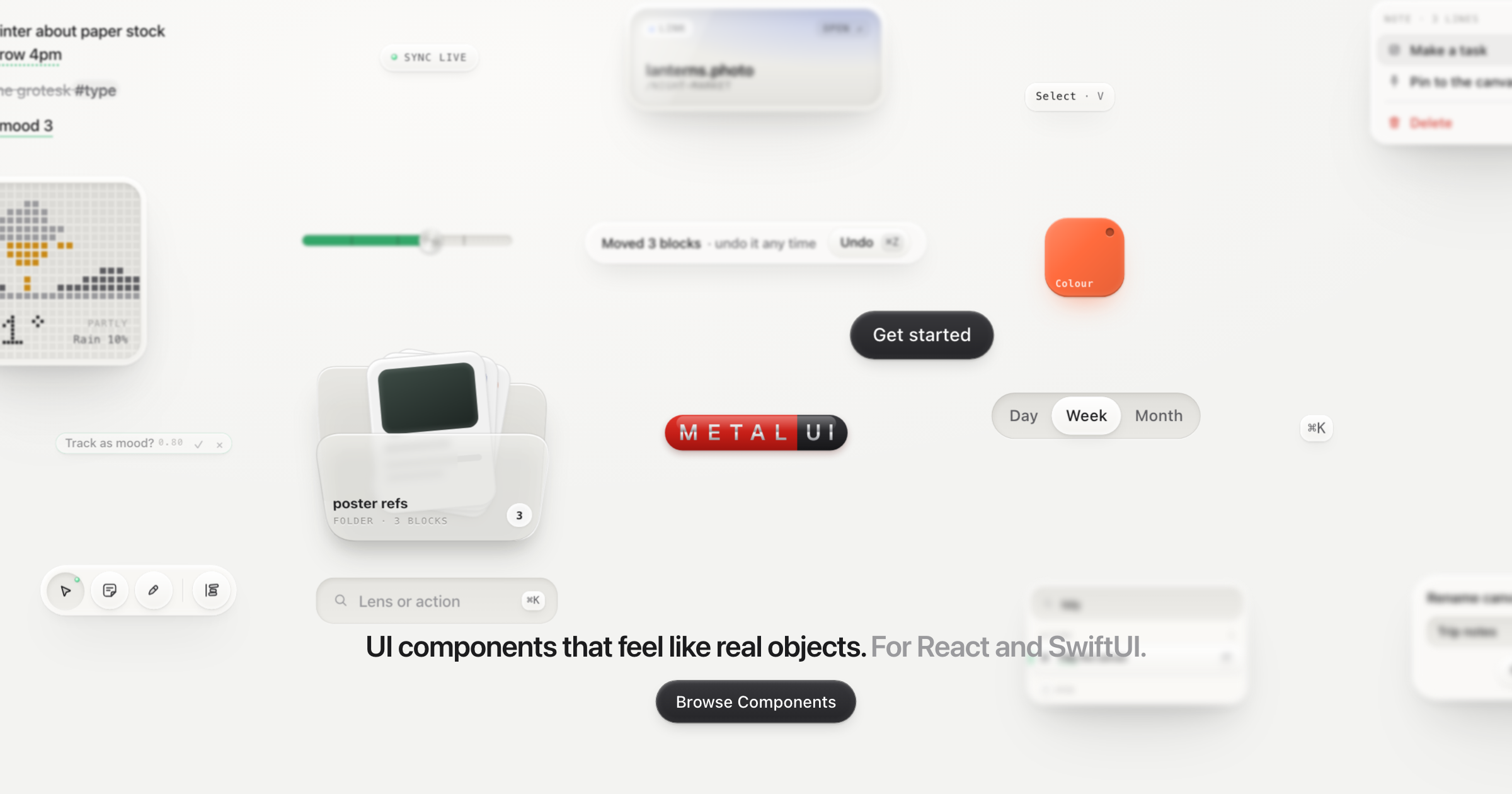
MetalUI
Soft Hardware components for React and SwiftUI: soft-touch plastic, smoked glass, knurled metal and LEDs, with buttons that press in and spring back.
photocn
GPU photo editor for React installed with the shadcn CLI: drop in the full editor, compose its canvas, filter and undo pieces, or go headless.
Baby UI
Animated React and Svelte components for dashboards, forms and agent UIs, installable as source via the shadcn CLI.
SureUI
Confirmation patterns for shadcn/ui: hold-to-confirm, double-click, type-to-confirm, undo, and dialogs.
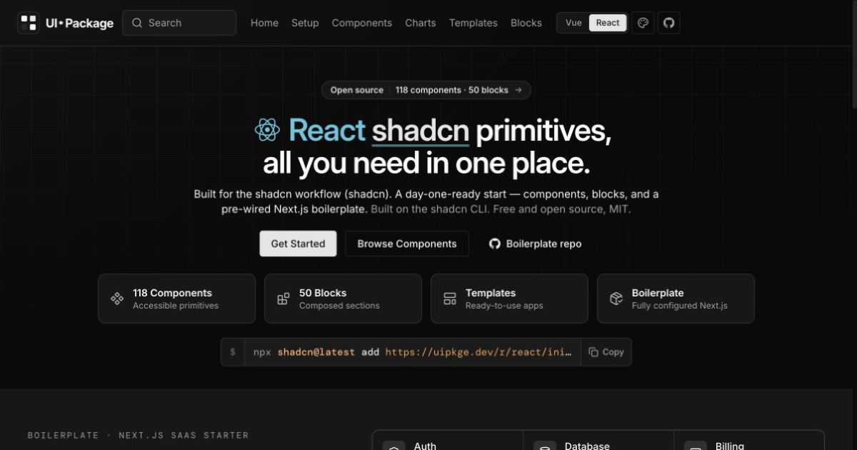
uipkge
Dual Vue/Nuxt and React/Next shadcn-compatible registry with over a hundred components and hundreds of blocks.
Bricka
Composable React AI composer where mentions, commands, and files become structured tokens inside the message.

DGit UI
Quiet React and Tailwind v4 shadcn registry for dashboard chrome, account menus, and sign-in screens.
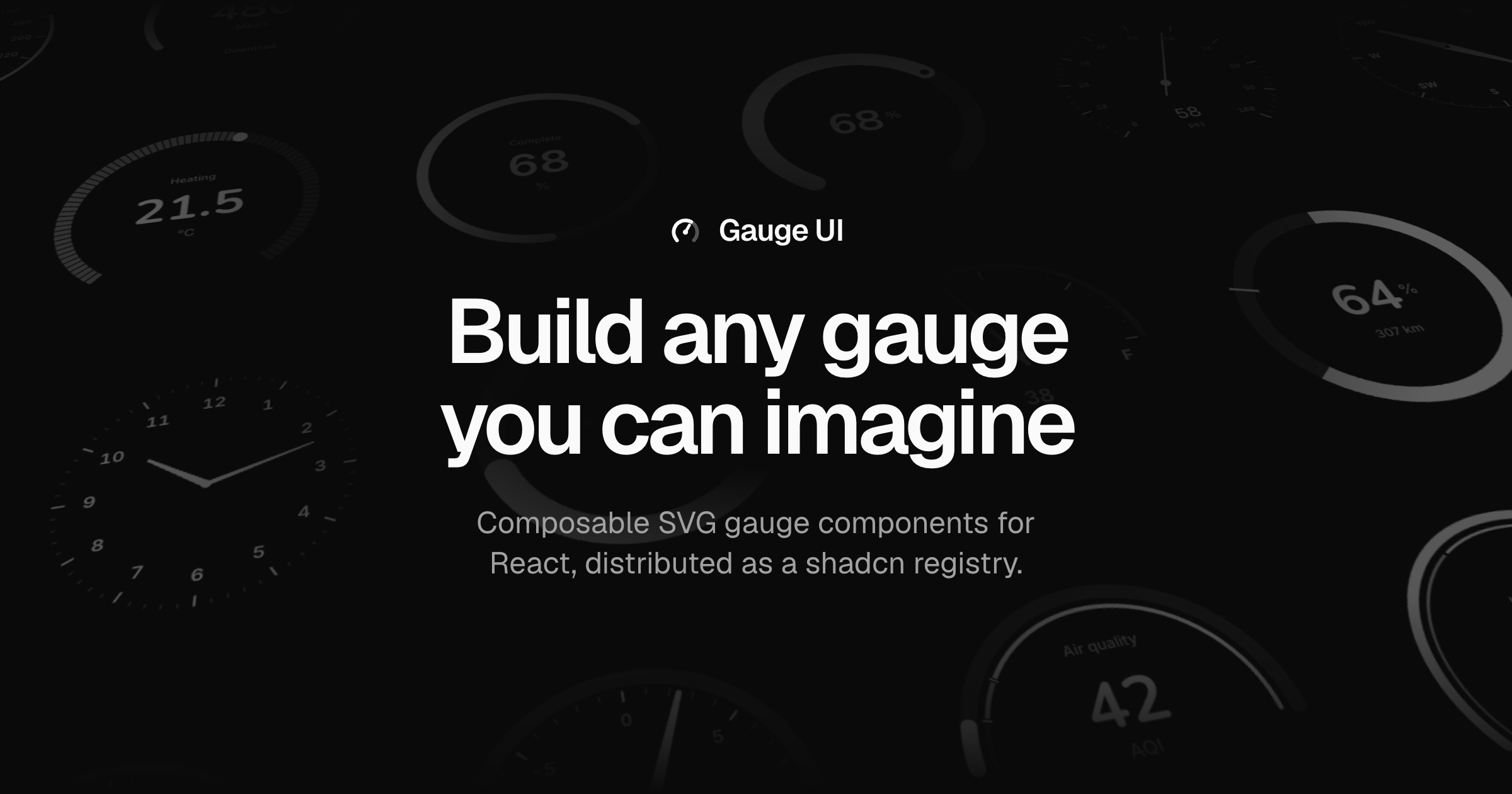
Gauge UI
Composable SVG gauge primitives for React, distributed as a shadcn registry with live composition examples.
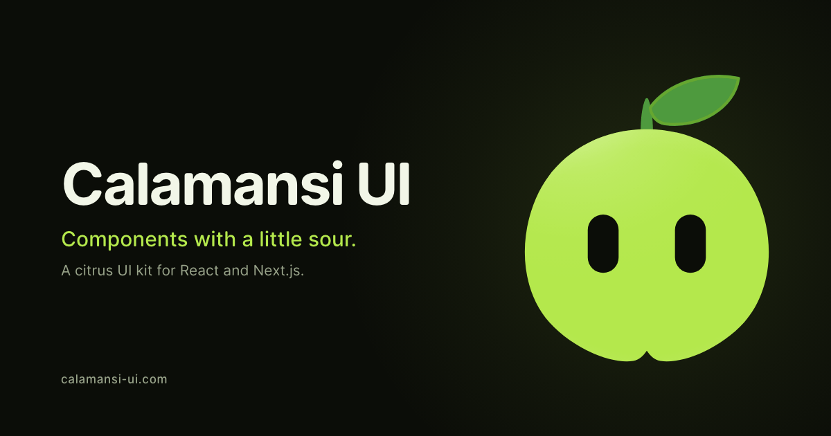
Calamansi UI
Fourteen playful animated React components you install with the shadcn CLI and own as editable source files.
Plasma UI
React components that render liquid-glass panels with refraction, blur fallbacks, and a live parameter playground.
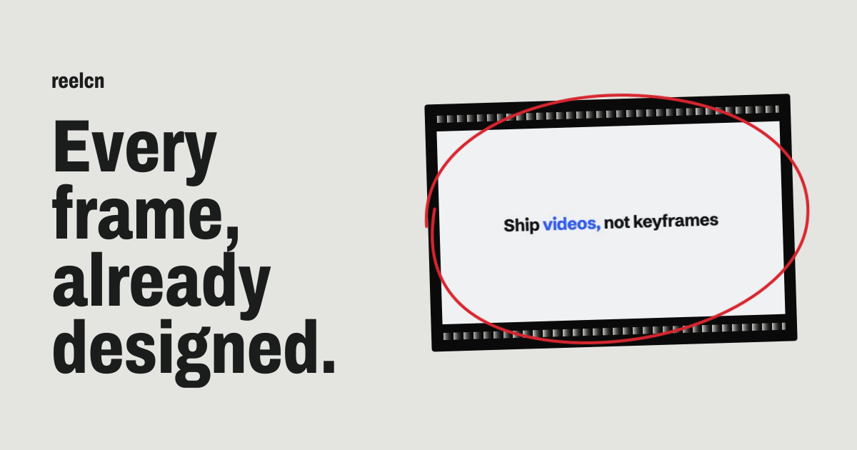
Reelcn
154 Remotion components and 14 templates installed via shadcn CLI. One timeline renders 16:9, 9:16 and 1:1 across six themes.
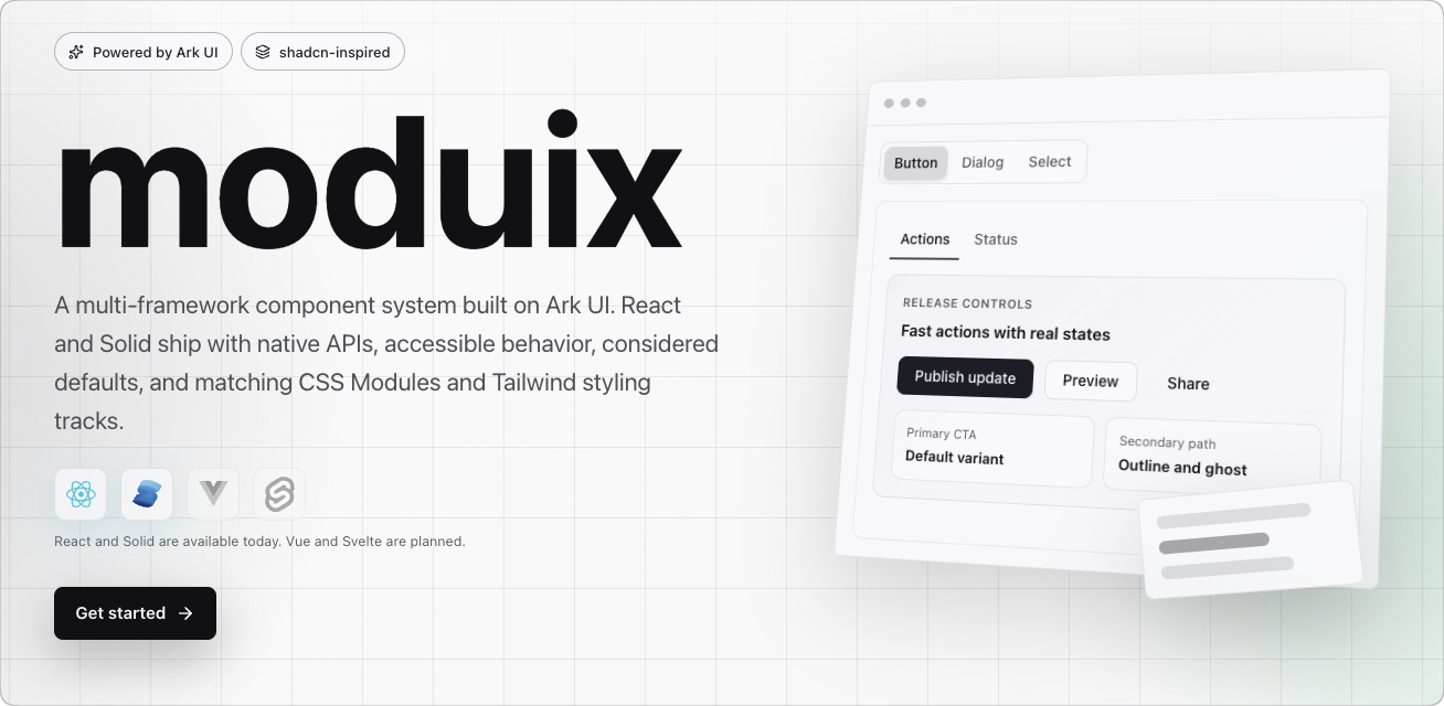
Moduix
Multi-framework component system on Ark UI for React and Solid, with matching CSS Modules and Tailwind tracks plus shadcn registries.
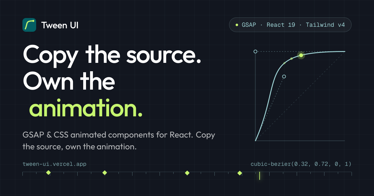
Tween UI
GSAP and CSS animated React components and page sections. CLI copies one .tsx file into your project with reduced-motion support.
Ram
React component that draws a design-tool selection frame around text with corner handles, thickness control and enter animations.
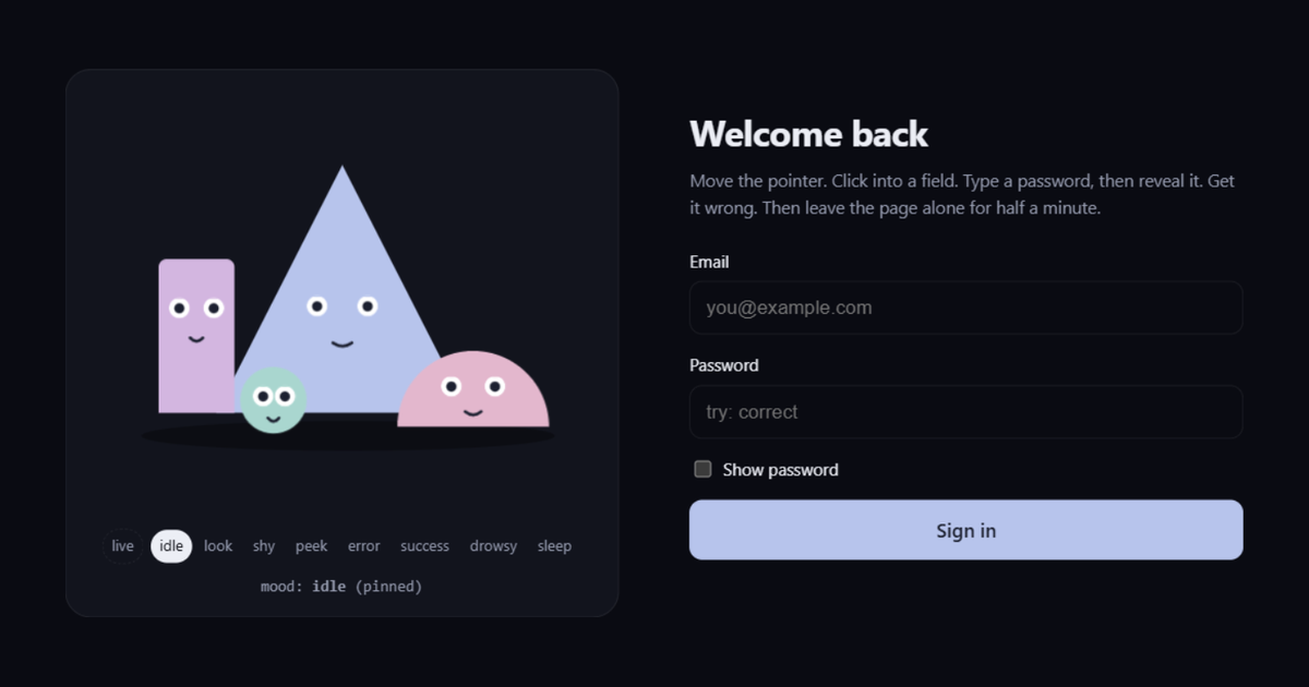
Form Friends
Four inline SVG characters that watch form fields, look away from passwords, sag on failure and nod off when idle — React only, no animation library.
medula
Dev-server MCP bridge so agents can inspect and edit live Vue, React, Svelte, or Solid app state from inside the running page.
Naive Icons
105 hand-drawn SVG icons on a 48×48 grid with thick strokes, a nine-color retro palette, and React components with zero runtime deps.
OpenShaders
Open-source home for web shaders: claim a username, explore name-generated shaders, and copy ready React or JS modules.
Cojeev UI
Warm, motion-minded React and Tailwind components with organic shapes, soft materials, and a shadcn registry install path.
a1ui
React and Tailwind registry of design-inspired components with agent install prompts, llms.txt, and shadcn CLI source.
react-input-icon
Composable React icon picker and renderer for Lucide, Heroicons, and custom SVGs, installed via the shadcn registry.
Badcn
Base UI and shadcn fill-ins for gaps like image inputs, debounce fields, loading buttons, and React Hook Form wrappers.

Libraries.dev
Five MIT React UI-effect packages for agent-built apps: border beam, thinking orbs, gooey, liquid metal, and WebGL image loaders. Each ships as a one-copy prompt for Cursor, Claude Code, or Codex.
Default File UI
Open design system with OKLCH scales, copyable React components, CLI registry, and an MCP server for agent installs.
react-ai-orb
Pure-CSS glowing React orb with eight palettes, eight presets, live speed control and reduced-motion respect, no canvas or WebGL.
React Loader Studio
Twenty-one typed SVG React loaders under 2 KB gzip, with a playground that exports size, color and speed as JSX.
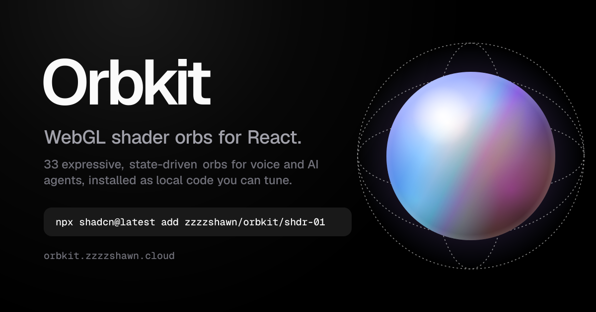
Orbkit
Free WebGL shader orbs for React agent states (idle, thinking, speaking), tunable in a playground and installable via shadcn registry.
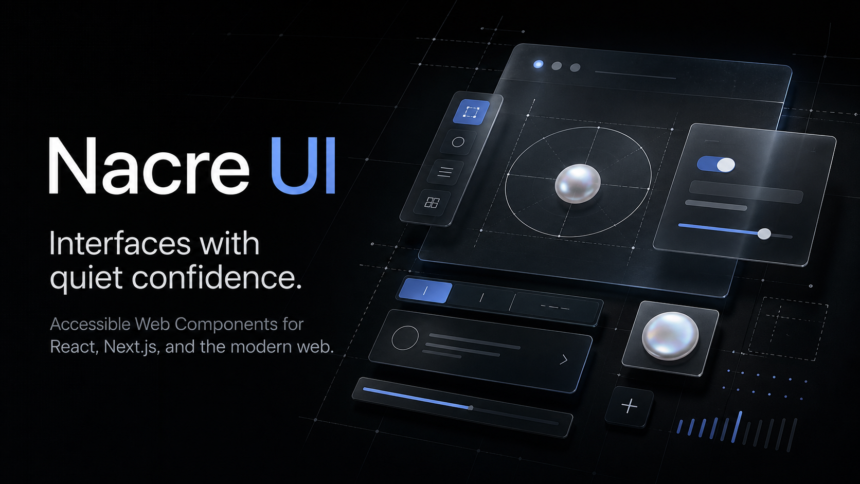
Nacre UI
Source-based React components with expressive motion, live previews you can parameterize, and a CLI that copies files into your project.
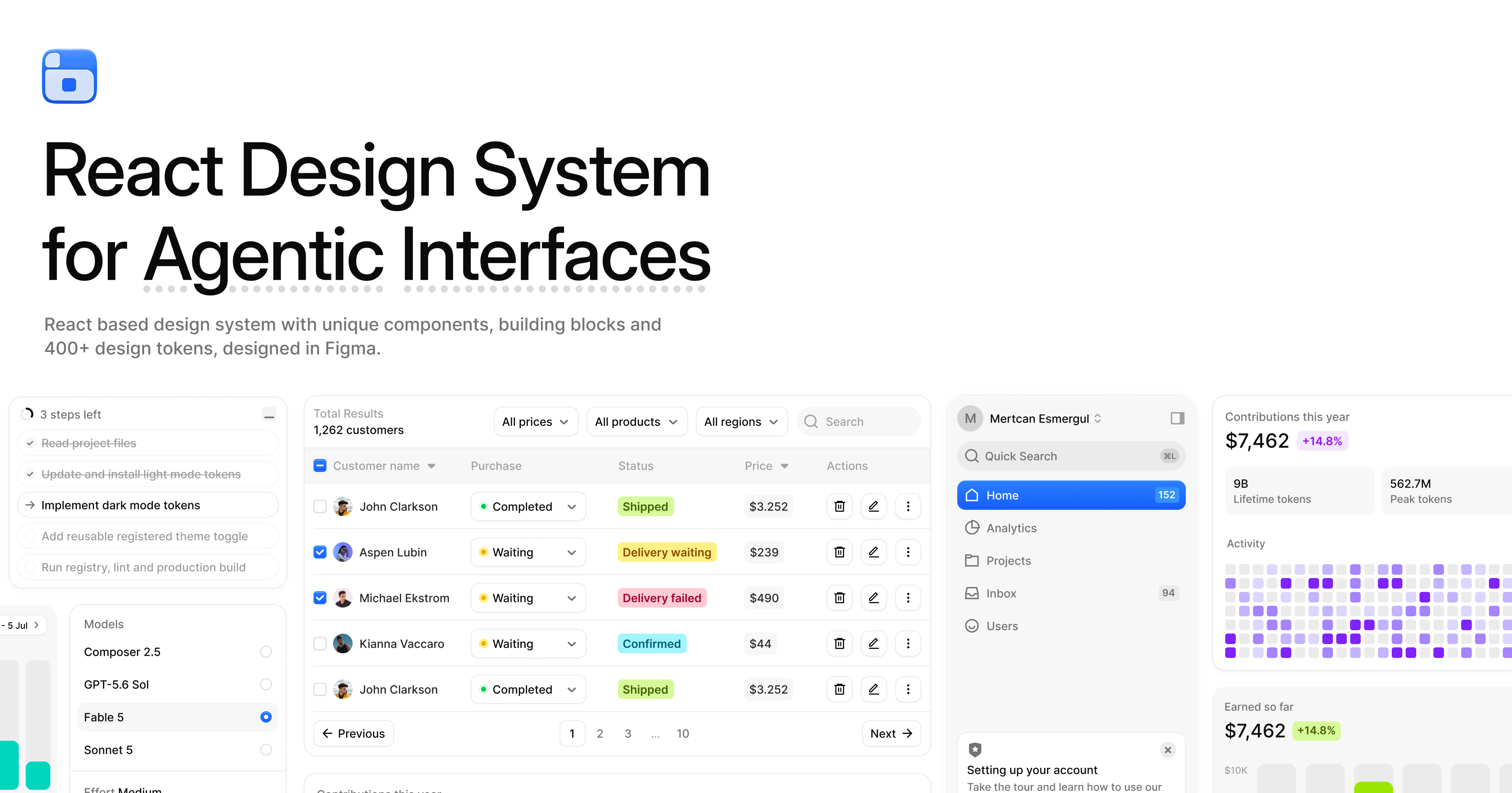
BoardUI
Source-owned React design system for dashboards and agent UIs: 72 components, charts, templates, plus CLI and MCP install paths.
MicroKit UI
Forty-three copy-paste React and CSS micro-interactions with Tailwind or plain CSS variants, no package to install.
react-rotary-fab
Watchmaker-inspired concentric rotary FAB and arc dial for React with multi-tier orbital physics and tactile haptics.
Cue
Imperative React overlay manager: register a dialog once, then open it from clicks, effects, or other overlays without local useState.
ui (adriangalilea)
Hand-crafted studio web components shipped as a shadcn registry: liquid glass, scroll stages, terminals, lightboxes, and more.
Pipecat UI
shadcn-installable React components, hooks, visualizers, and blocks purpose-built for Pipecat voice AI experiences.
tourcn
Spotlight product-tour component for React, delivered as source via the shadcn CLI on Base UI and Floating UI.
Wensity UI
MIT React component registry for Next.js and Tailwind v4 with motion-rich interactions, installable via CLI or copy-paste.
Stash Icons
MIT 24×24 SVG icon set in five styles (duotone, light, regular, solid, editor) as React packages, with a Figma source.
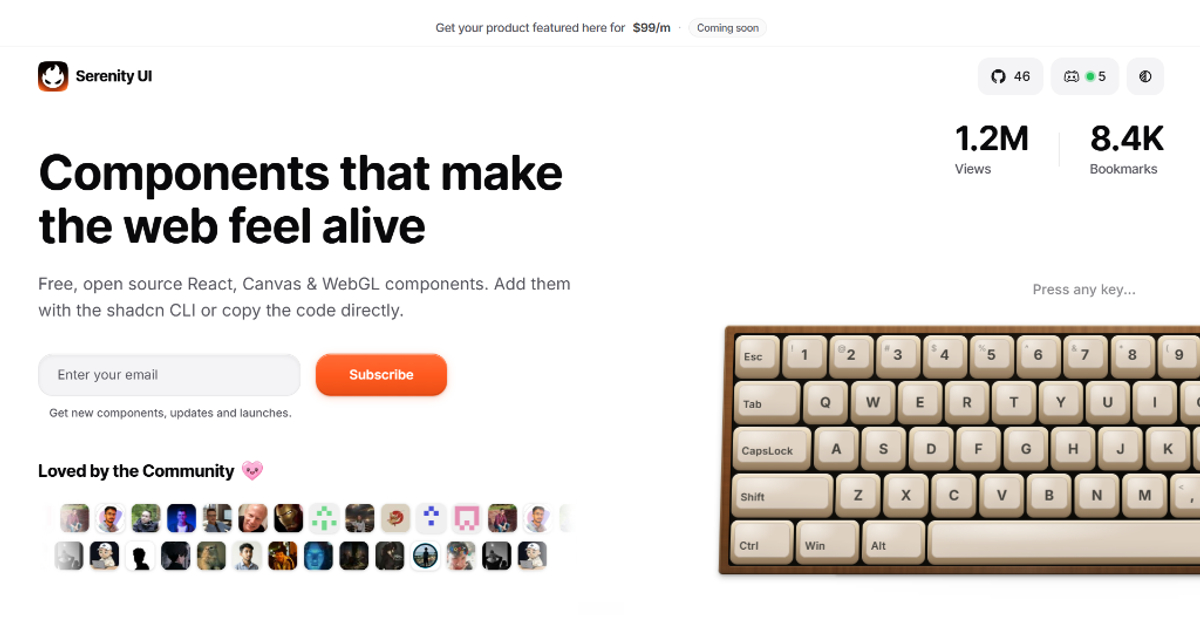
Serenity UI
Free, open-source React, Canvas and WebGL components, blocks and templates you can install with the shadcn CLI or copy directly.
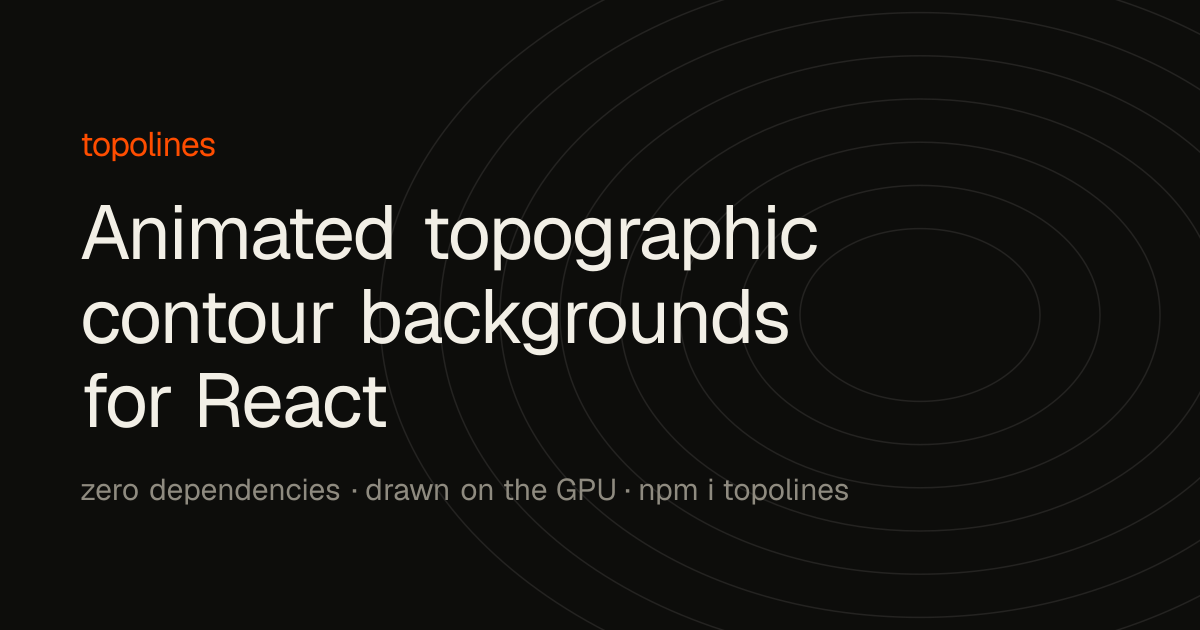
topolines
One React component that draws animated topographic contour backgrounds on the GPU, with six presets and a live playground.
revealed
WebGL library that stacks two images and lets the pointer, scroll or your own state paint a noise-carved hole through the top one.
Sona UI
React and Tailwind component registry of motion primitives — fluid tabs, expanding actions, animated dialogs — installed into your codebase via shadcn CLI.
Vivid Layer
shadcn registry of React components and WebGL shaders — mesh gradients, paper texture, chat minimaps — with live parameter playgrounds and editable source.
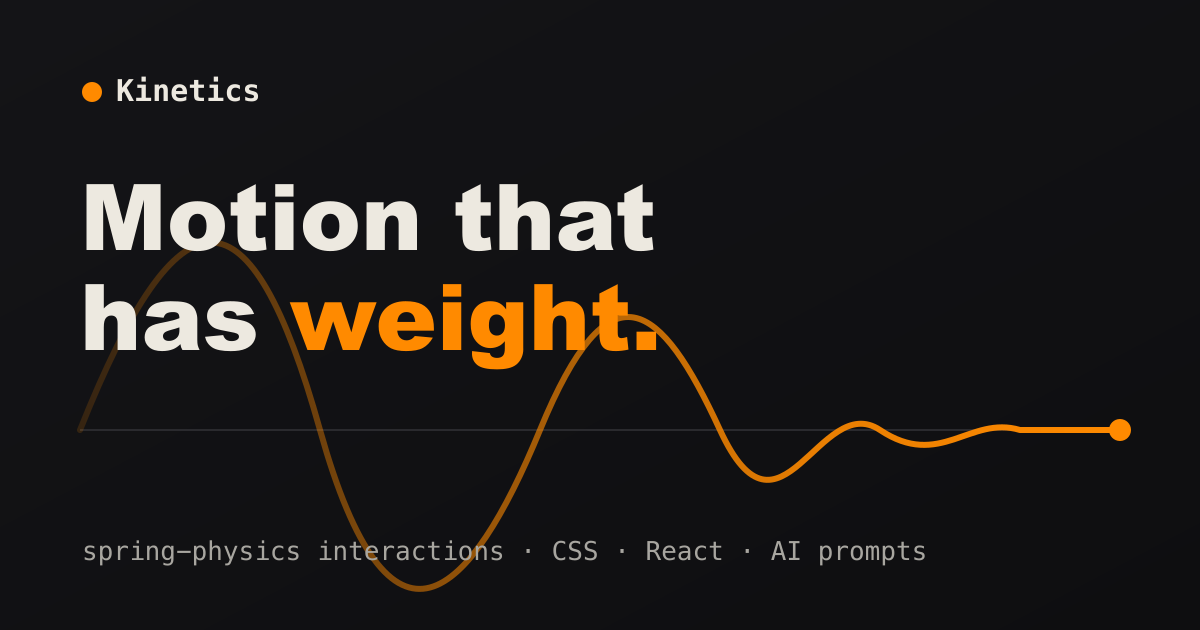
Kinetics
153 interface animations built on spring physics rather than fixed-duration easing; tune stiffness and damping, then copy CSS, React or an AI prompt.
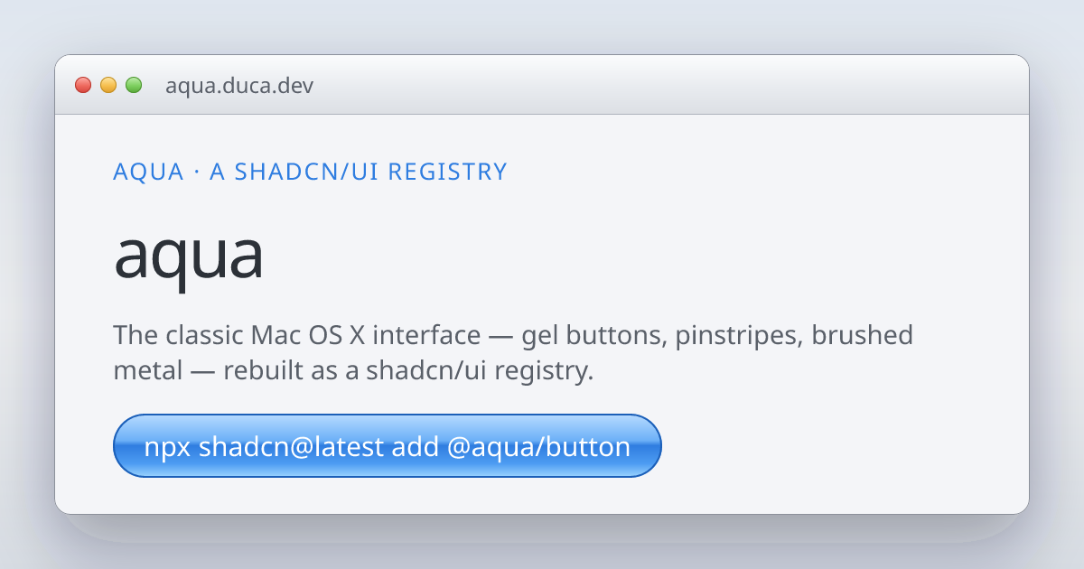
Aqua
shadcn/ui registry that rebuilds the Mac OS X Aqua interface: gel buttons, pinstripes, brushed-metal windows, a working Dock and iPod.
Flagcn
306 country-flag React components installable through the shadcn CLI, in SVG, PNG, WebP or JPEG at 4:3, square or original ratios.
pdfcn
shadcn-distributed React components for generating PDFs: page headers, key-value blocks, tables, footers, plus invoice and report templates.
AICSS
Copy-paste components for agent conversation UI: thinking states, tool calls, file diffs, streaming text, citations, approval cards and task lists.
Source → Design
Figma plugin that renders a local HTML file or a React, Next.js, Vue or Svelte project ZIP in Chromium and rebuilds it as organized editable layers.
moco
Editorial React components for technical writing: scrollytelling, Tufte margin notes, inline sparklines, number scrubbers, annotated code, HTML block diagrams.
IconsRoom
Searchable front-end for 250,000+ open-source icons across 150+ sets, with colour and stroke customisation and SVG, PNG, React or Vue export.
Visimer
Embeddable WYSIWYG editor for Mermaid diagrams — drag nodes, rename labels and change shapes, with Monaco and CodeMirror bindings plus a headless mode.
FrontFamily
Converts components between MUI, Chakra, Ant Design, Mantine, EUI, Bootstrap and Quasar using 219 hand-verified mappings, running entirely in the browser.
Beautiful UI
Copy-paste components for agent interfaces: chat, streaming text, thinking states, human-in-the-loop approvals, task lists and result rendering.
undraw-cn
Components that wrap unDraw illustrations so they can be themed and dropped into shadcn projects as source.
Onborda
Product tour and onboarding component for Next.js with step targeting, masking and route awareness.
react-mobile-picker
iOS-style scrolling wheel picker for React, useful for date, time and constrained option selection on touch.
Neobrutalism components
shadcn and Radix components restyled with thick borders, hard shadows and flat colour in the neobrutalist idiom.
shadcn-table
Data table for React with server-side pagination, filtering, sorting and column controls on TanStack Table.
React Joyride
React walkthrough library that positions and styles tour steps while letting you supply your own components.
react-colorful
A 2.5KB dependency-free, accessible colour picker for React with no runtime styling requirement and full keyboard support.
Motion Primitives
Copy-paste animated React components built on Motion: text effects, docks, dialogs and transition primitives.
emblor
Customizable React tag input component with autocomplete, validation, keyboard navigation and shadcn styling.
shadcn-hooks
Registry of installable React hooks distributed through the shadcn CLI alongside your components.
Planner
Adaptable React scheduling component for resource and time-slot planning built on shadcn primitives.
UI Builder
No-code visual editor that composes React and shadcn components into layouts and exports real code.
TableCraft
Table engine wiring Drizzle ORM queries to a React data table with filters, sorting and export.
Dice UI
Accessible shadcn/ui component set covering data tables, kanban, sortable lists, mentions and file upload, built on WAI-ARIA primitives.
shadcn-editor
Lexical-based rich text editor themed with shadcn/ui components and installable via the shadcn CLI.
scificn-ui
Retro science-fiction design system of React components with angular frames, HUD panels and readouts.
shadcn-dropzone
File upload dropzone for React built on react-dropzone with progress, preview and shadcn styling.
AgnosticUI
CLI that copies Lit web components into your project with React and Vue wrappers generated alongside.
Jolly UI
shadcn/ui-compatible React components rebuilt on React Aria Components, trading Radix for stronger accessibility guarantees.
beautiful-react-hooks
Collection of forty-plus React hooks for drag-and-drop, geolocation, storage, media queries, animation frames and lifecycle events.
react-jsonschema-form
Builds and validates complete forms from a JSON Schema, with themes for Bootstrap, MUI, Chakra and more.
shadcn-kanban-board
Production-ready Kanban board for React with drag-and-drop columns, cards and keyboard accessibility.
warcraftcn
React components recreating the Warcraft III interface chrome: panels, portraits, ornate frames and buttons.
Liquid Metal
Animated liquid-metal border component for React with fluid chrome-like reflections and tunable motion parameters.
react-highlight-popover
Headless React component that shows a popover when the user selects text, with no styling opinions.
IMask
Vanilla JS input masking supporting pattern, number, date, regex and dynamic masks, with official React, Vue, Svelte and Solid bindings.
Dominik UI
Opinionated components and tools for building AI chat and agent interfaces, published out of a personal portfolio repo.
lingua-time
Datetime picker that parses natural language input like next friday at 3pm into a concrete date.
Cult UI
Animated shadcn-compatible components aimed at design engineers: texture cards, dynamic islands, popovers and expandable layouts.
Thinking Orbs
Dotted thought-orb loading indicators built for AI and agent interfaces, with variants and copyable component code.
React Spring
Spring-physics animation library that interpolates any value type and runs off the React render loop for imperative performance.
Intergalactic
Semrush's design system with React components, a charting layer and documented rules for data-heavy SaaS interfaces.
Odyssey
Okta's design system focused on identity, auth and security flows with React components and Figma kits.
Palette
Artsy's React and React Native design system with an art-world visual language and shared cross-platform primitives.
Kaizen
Culture Amp's design system with React components, illustration library and explicit inclusive-design and content principles.
Geist
Vercel's design system: colour and typography foundations, Geist Sans and Mono typefaces, icon set and React components.
Backpack
Skyscanner's design system with React, iOS and Android implementations plus documented motion and RTL specifications.
Westpac GEL
Australian bank's design system with React components, extensive form patterns and documented financial-services accessibility requirements.
Circuit UI
SumUp's React design system for payments and point-of-sale interfaces, with documented money-input and currency patterns.
Orbit
Kiwi.com's travel-oriented design system with React components, Figma libraries and documented booking-flow patterns rarely found in generic systems.
DialKit
Floating React control panel with sliders, toggles and colour pickers for tweaking values live in a running app.
dither-kit
Composable dithered chart components for React using a Recharts-style children-as-config API.
Glide Data Grid
Canvas-rendered React data grid handling millions of rows with native scrolling, inline editing and markdown/image cell types.
Mística
Telefónica's multi-brand design system where one component library serves Movistar, O2, Vivo and Tu through swappable skins.

Instructure UI
Education-platform design system with React components, strict accessibility gates and a documented deprecation and codemod process.
Reaviz
React chart library with unusually strong defaults for radial, sankey, treemap and calendar heatmap types plus built-in motion.
Hover.dev
Library of animated React and Tailwind components including glow buttons, spotlight cards, marquees and hero effects.
Nephele
React tool for generating volumetric cloud textures from layered SVG turbulence filters.