The Vibeary — tag
design-system
21 resources in The Vibeary tagged "design-system" — tools, libraries and references pulled from across the library's shelves, each one checked by hand before it was added.
Gems in this collection
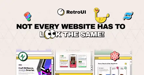
RetroUI
React component library applying a neo-brutalist retro design system across buttons, cards, dialogs and form controls.
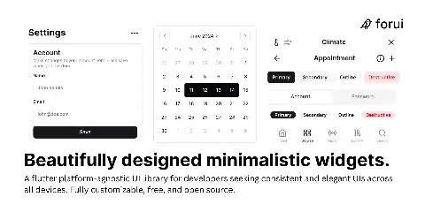
Forui
Flutter widget library of minimalist, platform-agnostic components heavily modelled on shadcn/ui, with theming and full customisation.
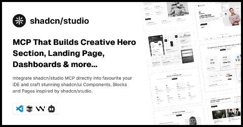
shadcn studio MCP
Hosted MCP endpoint that feeds shadcn/ui component and design-system context into Cursor, Claude Code and Windsurf.
Themer
Swaps a selection between identically named style libraries, so one file can preview light, dark and brand themes.
UIAble
Open shadcn-based UI system with 700+ items aimed at production apps, maintained by the CodedThemes team.
design-systems-mcp
MCP server that answers design-system questions about components, tokens, patterns and best practice from a curated corpus.
Lume
Vue 3 chart component library from Adyen built on D3 with a strict design-system-first component API.

Lucidi
Syncs opacity-derived styles from a set of primary color styles, keeping tints and overlays consistent as brand colors change.
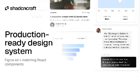
ShadcnCraft
Polished shadcn/ui components and blocks built to production standards as part of a paired Figma and React design system.
Design Lint
Scans Figma frames for missing styles, off-system colors and stray text properties, then jumps you to each error.
figma-plugin-ds
Vanilla CSS and JS component library that matches Figma's own plugin UI, so your plugin looks native.
Accessible Color Systems
Stripe engineering post on building a colour system that guarantees contrast ratios while preserving brand hue relationships.
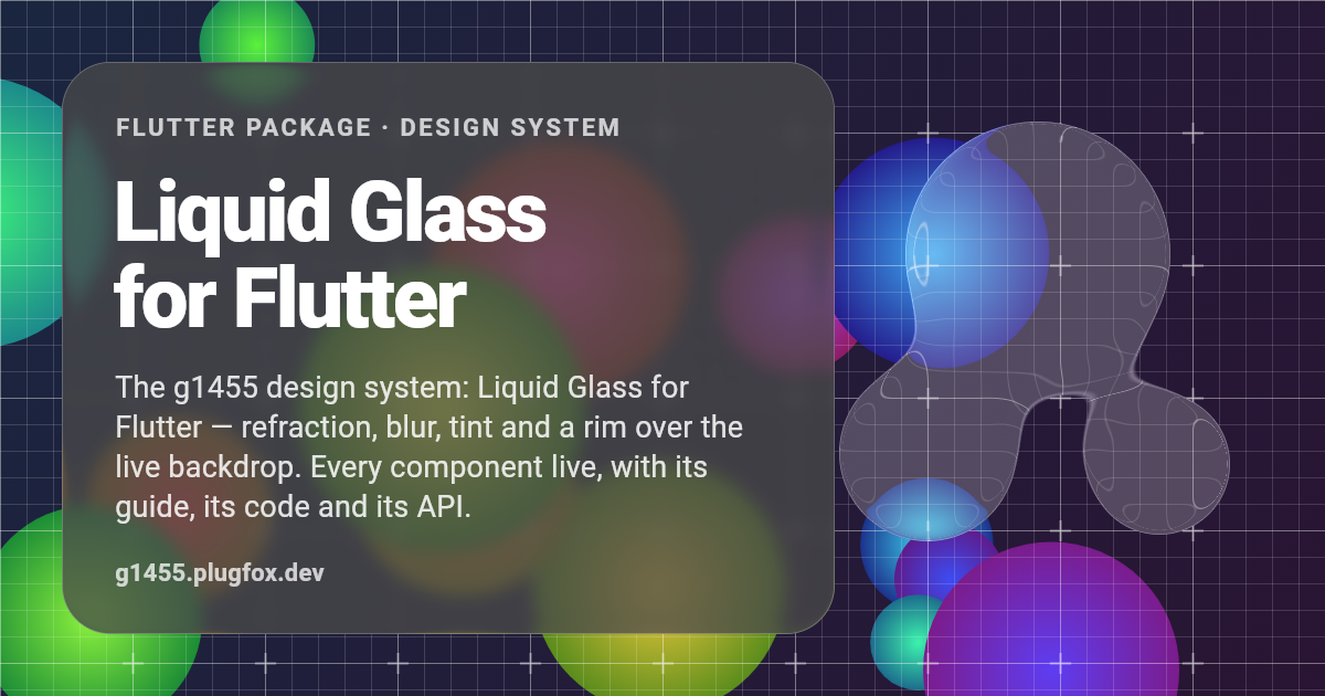
g1455
Liquid Glass design system for Flutter with refraction, blur, tint and rim over the live backdrop; every component documented live with guide, code and API.
Mizu
React library of 126 component systems across 14 families, including timelines, charts, editors, readers and instrument controls, in warm ink-and-paper styling.
Ely GPUI Components
Warm, quiet light and dark component library for GPUI, the Rust UI framework behind Zed, with every story running live in the browser via WebAssembly.
Default File UI
Open design system with OKLCH scales, copyable React components, CLI registry, and an MCP server for agent installs.
Super Prototyping
Copy any app UI into plain HTML artboards on a local canvas with measured colors and metrics, no design tool required.
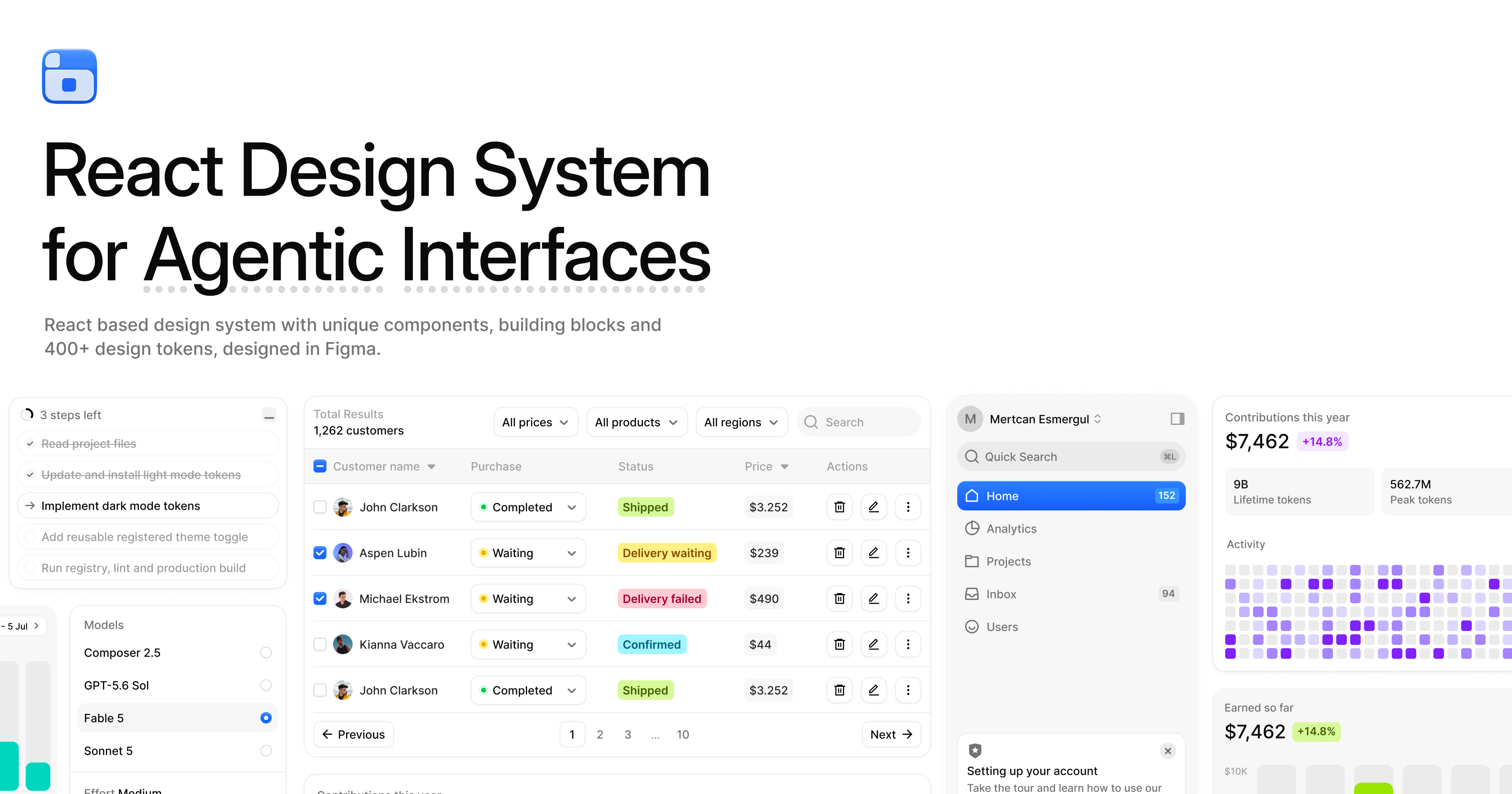
BoardUI
Source-owned React design system for dashboards and agent UIs: 72 components, charts, templates, plus CLI and MCP install paths.
UI-Anatomist
Chrome extension that scans a rendered web UI's observable styles, states and icons, plus a Figma plugin that rebuilds them as editable variables and components.
Lion Web Components
Accessible, performant white-label web component primitives from ING Bank, intended as design system foundations.
Tamagui
Cross-platform style library and UI kit with a compiler that flattens styles to static CSS for web performance.